Backlight - Build Design Systems - Tool for front-end teams
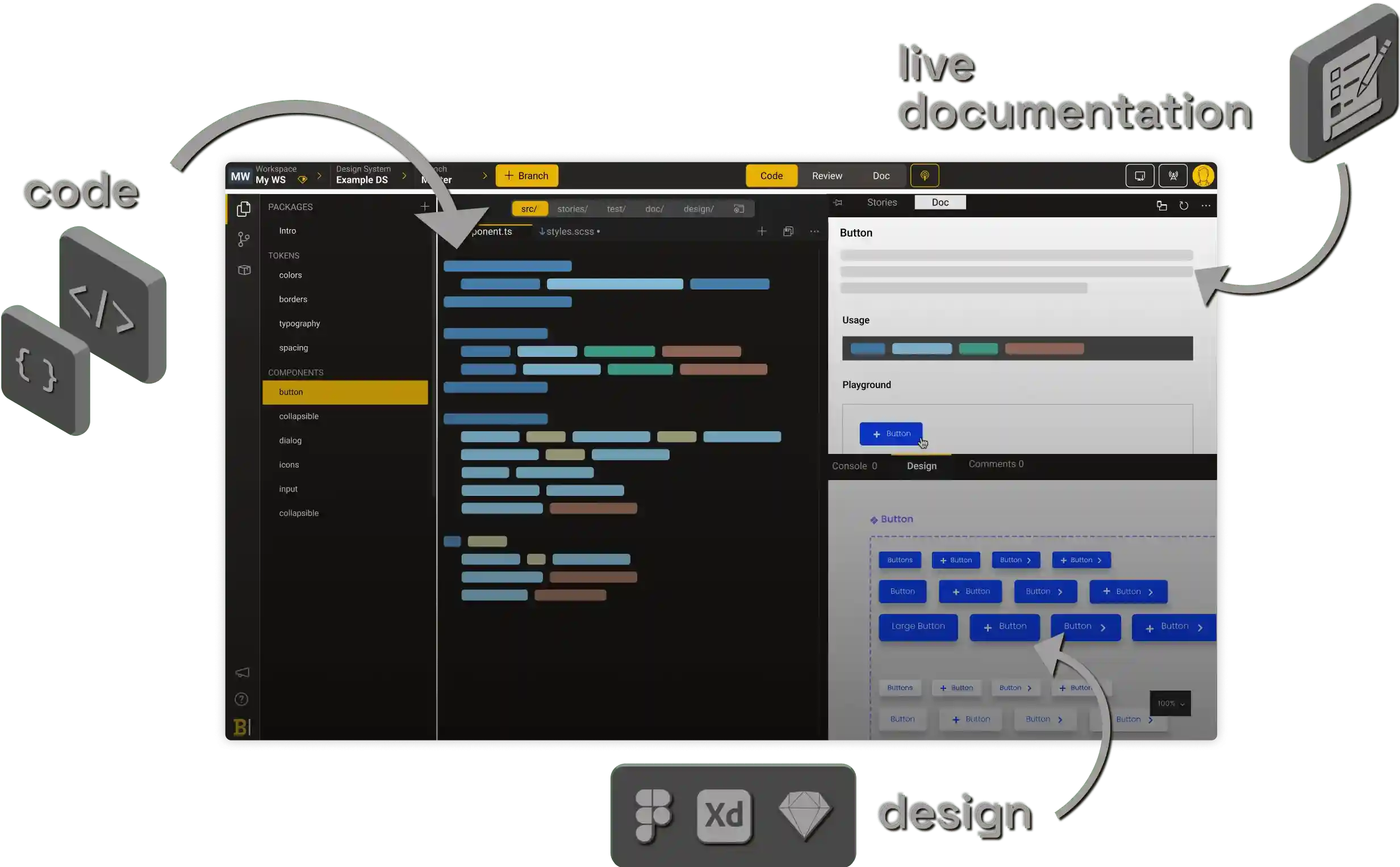
Code
Use your own IDE
Use Backlight’s CLI with your favorite IDE on your local machine. Backlight works with Visual Studio Code, WebStorm or any other local editor.
Built-in online editor
Backlight comes with an online editor that allows anyone (even non-tech disciplines) to contribute to your design system, making it simple to create branches and push to GitHub and GitLab.
All stacks supported
Backlight is powered by Vite in the browser to support any stack, so you’ll be sure Backlight works for you.
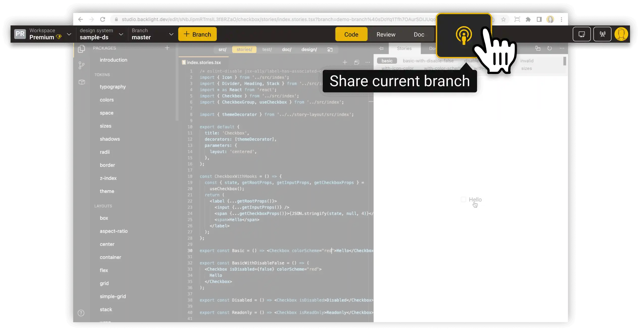
Share components instantly
Share real-time previews of the component you’re working on without having to push, release or deploy anything.
No lock-in
Backlight promotes 100% standard web development technologies. You are free to eject your design system and continue outside of Backlight at any time.
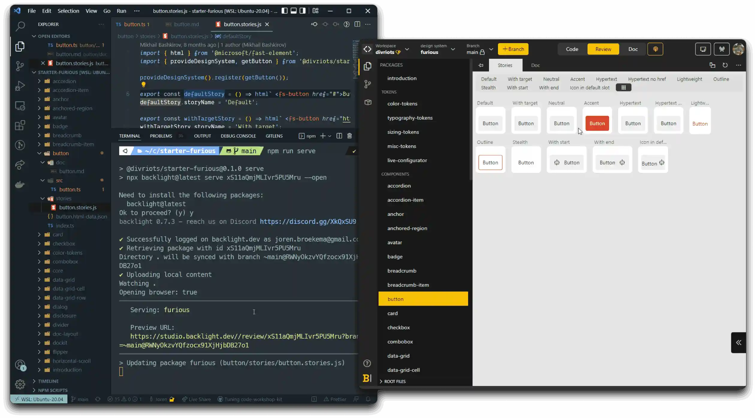
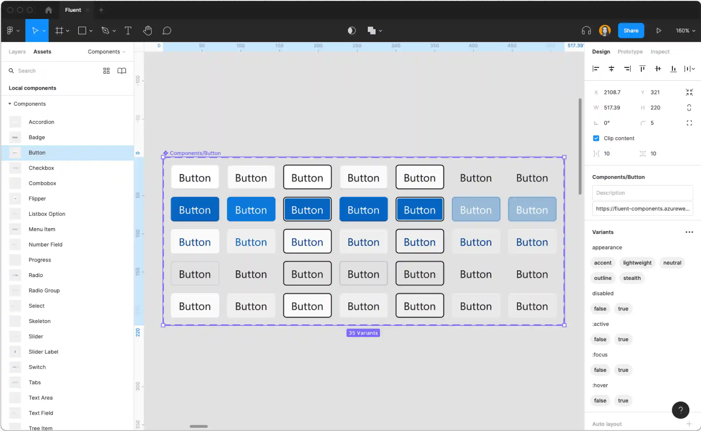
Stories
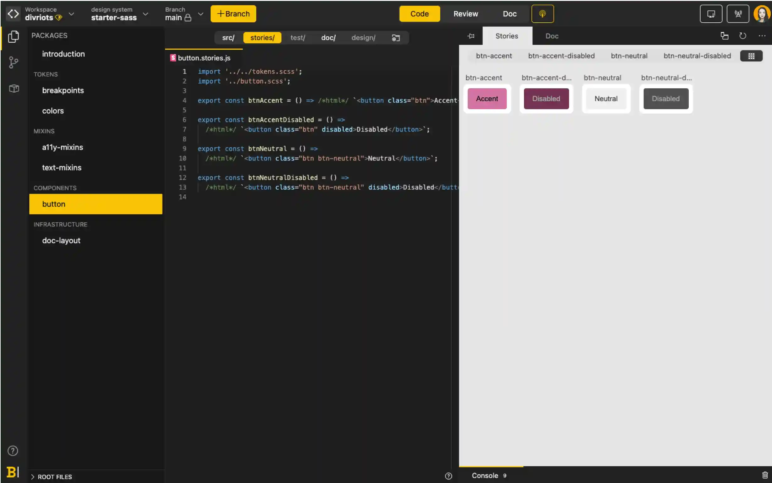
Storybook-compatible
Backlight supports Storybook stories out-of-the-box. Display your stories next to your code for perfect development-design alignment.
Simulate real user behavior
Test your components, simulating real user behavior, with built-in support for Storybook’s new interactive stories.
Multiple stories frameworks supported
Test your components, simulating real user behavior, with built-in support for Storybook’s new interactive stories.
Collaboration
Get quick feedback with instant sharing
Developers and designers can collaborate spontaneously and get immediate feedback, thanks to instant sharing. No need to push or wait for a release.
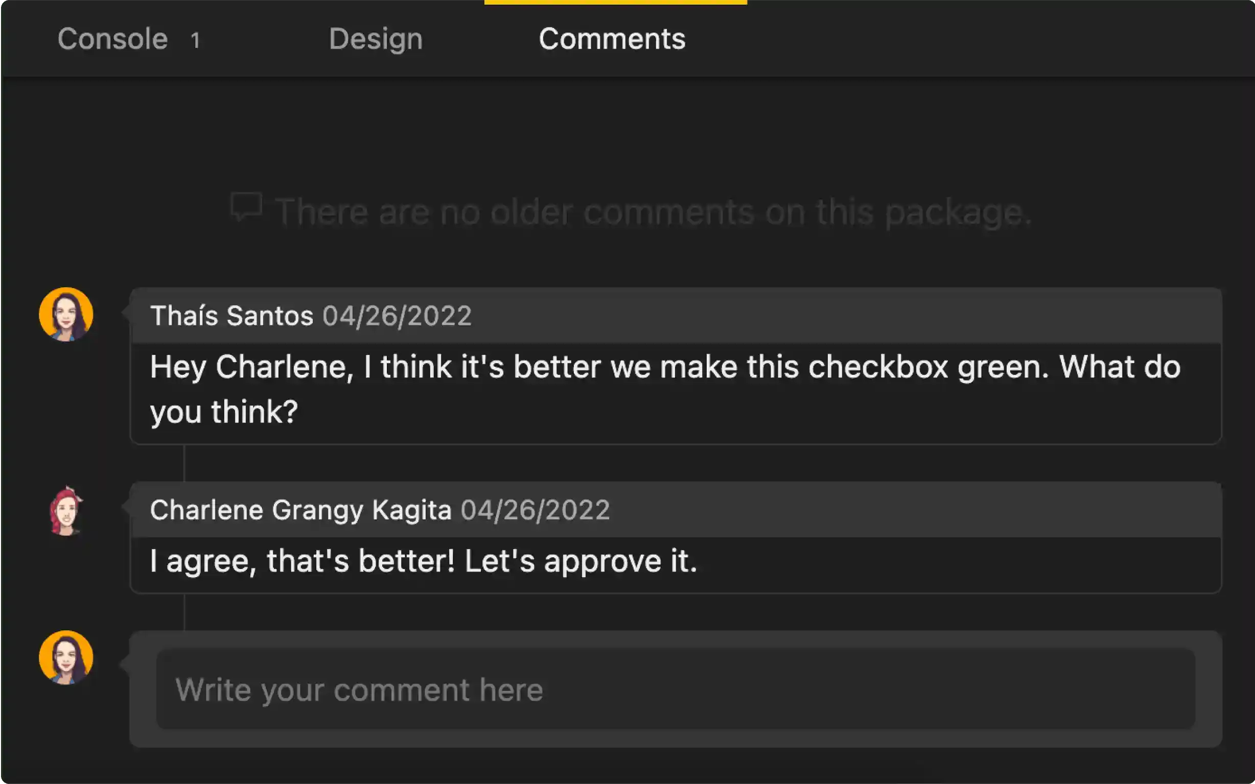
Collaborate asynchronously with comments
Leave comments directly on the components you’re working on for your team to look at in their own time.
Easy for anyone to contribute
With a visually-organized component library, it's easy for anyone to discover and contribute to your design system, no matter their level of tech knowledge.
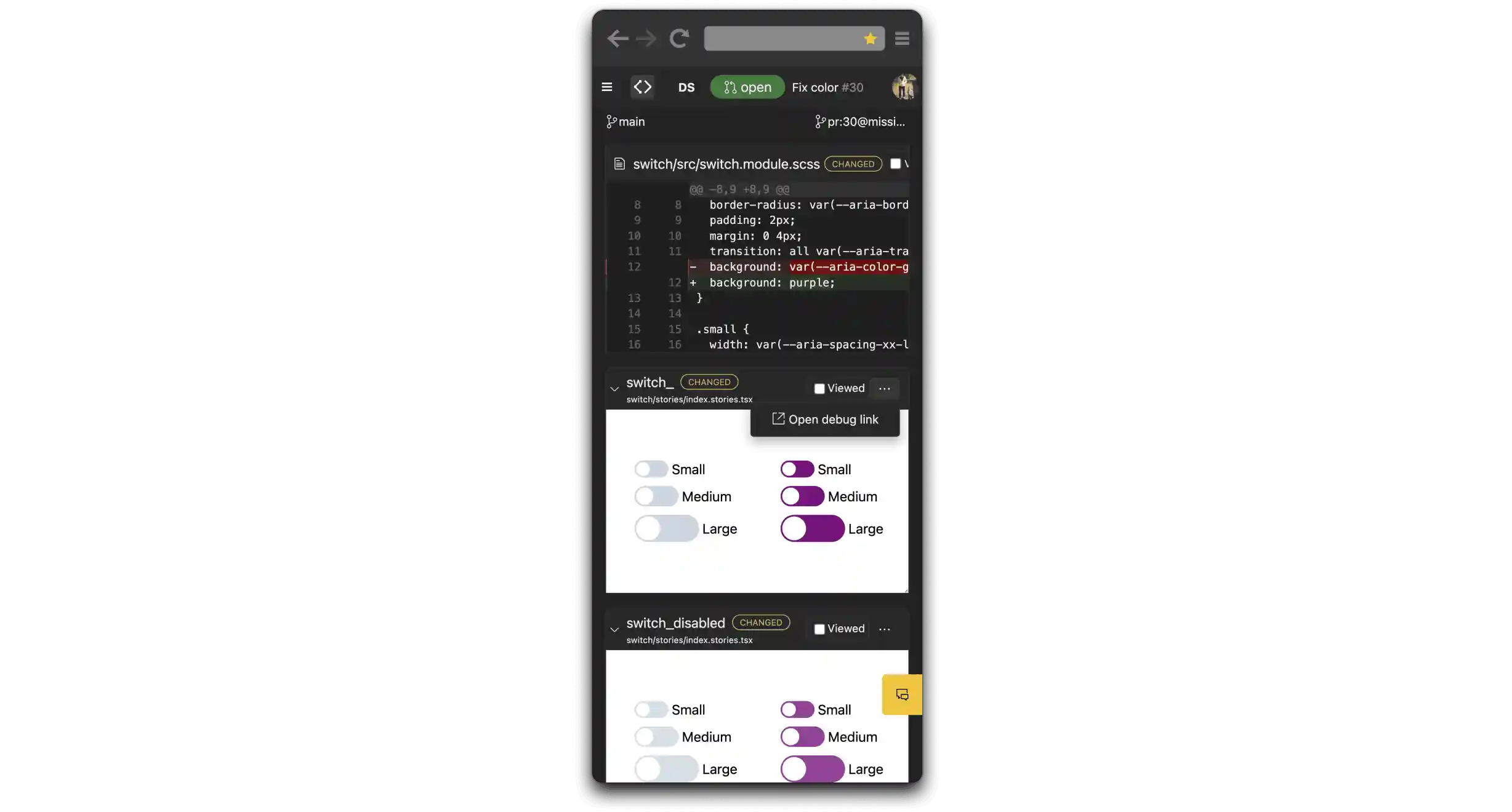
Visual PR
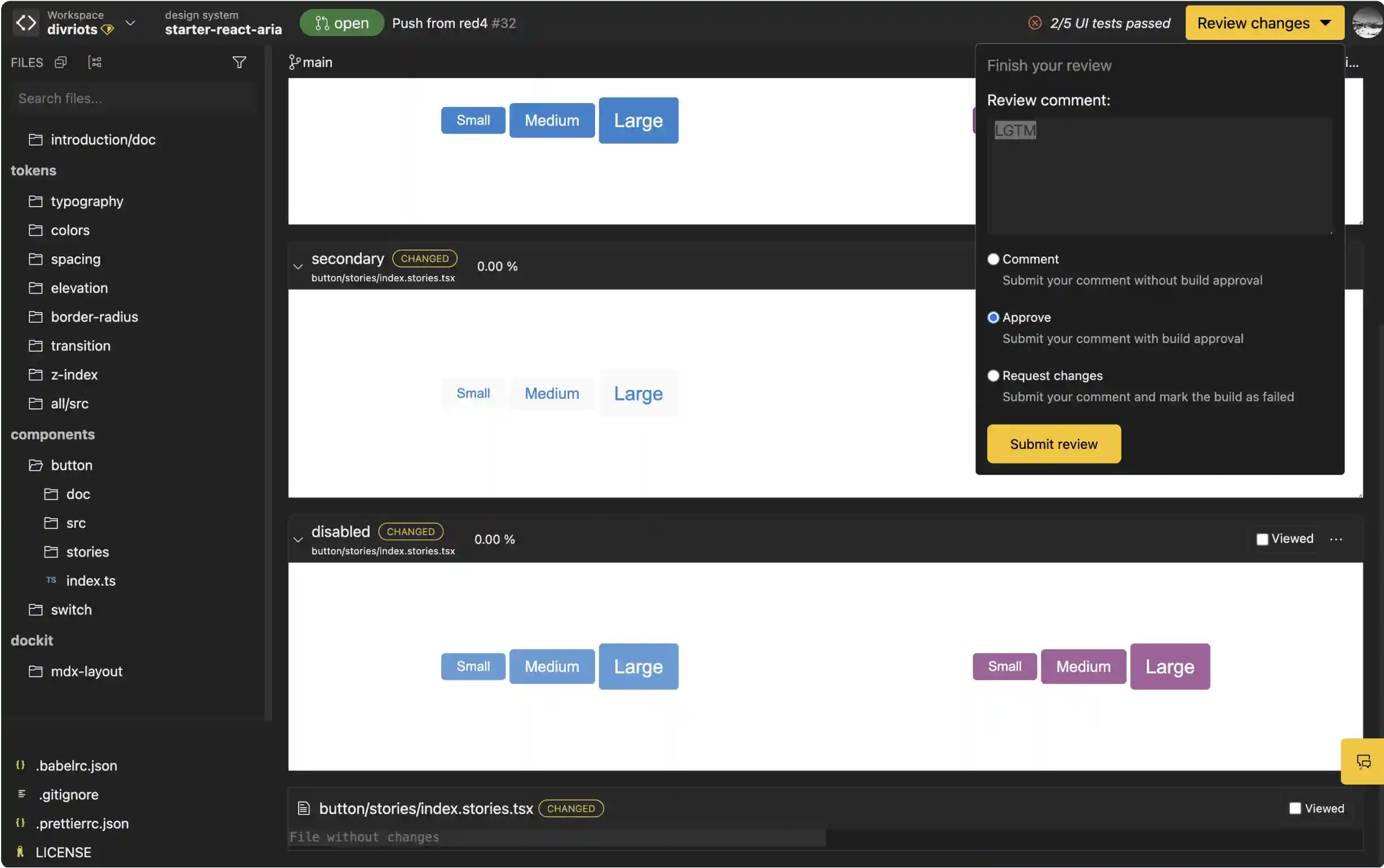
Validate faster with visual pull-request reviews
Thanks to Backlight’s bot, Backlight renders pull-requests instantly for fast visual review. You don't need to wait for the build task or the deploy task in your CI.
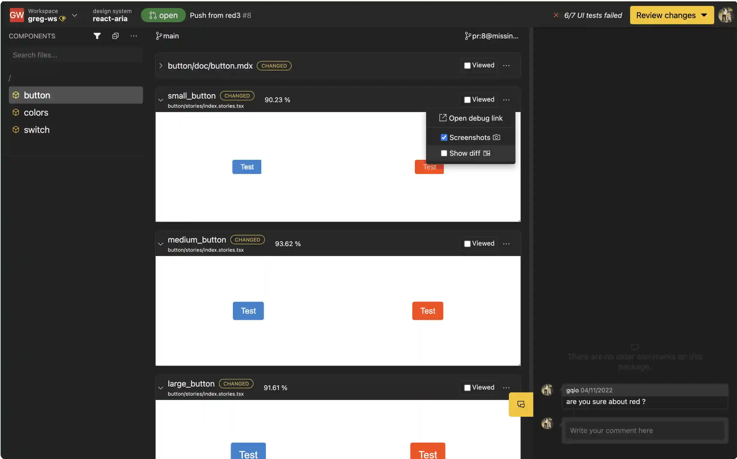
Visual regression detection
Backlight helps you review only the components that visually changed, so you can focus your review on things that really matter.
Review pull-requests on the go
With Backlight’s responsive online editor, you can review pull-requests directly from your phone.
Design integration

Link to your designs
Streamline collaboration between developers and designers. Keep code and design in one place thanks to design previews directly next to your components. Figma, Sketch and Adobe Xd are fully supported.
Turn coded stories into UI kits
Turn all of your stories into a complete Figma UI kit in minutes.
Design tokens
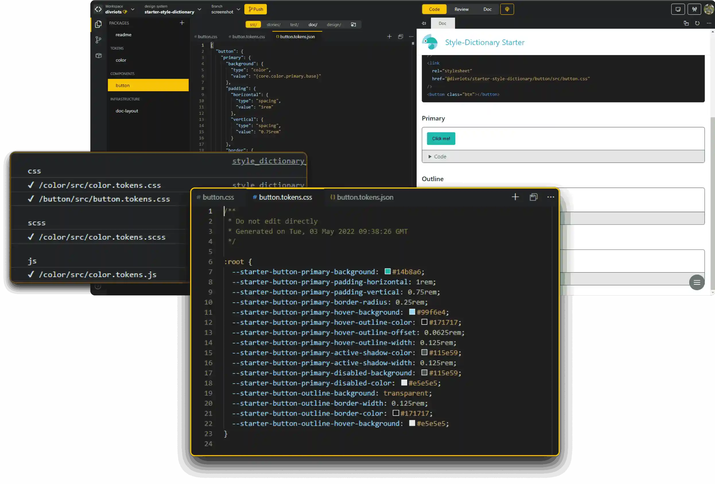
Style-Dictionary support
Built-in Style-Dictionary support means you can define styles once then export to all the places you need them - iOS, Android, CSS, JS, HTML, Figma files, style documentation...
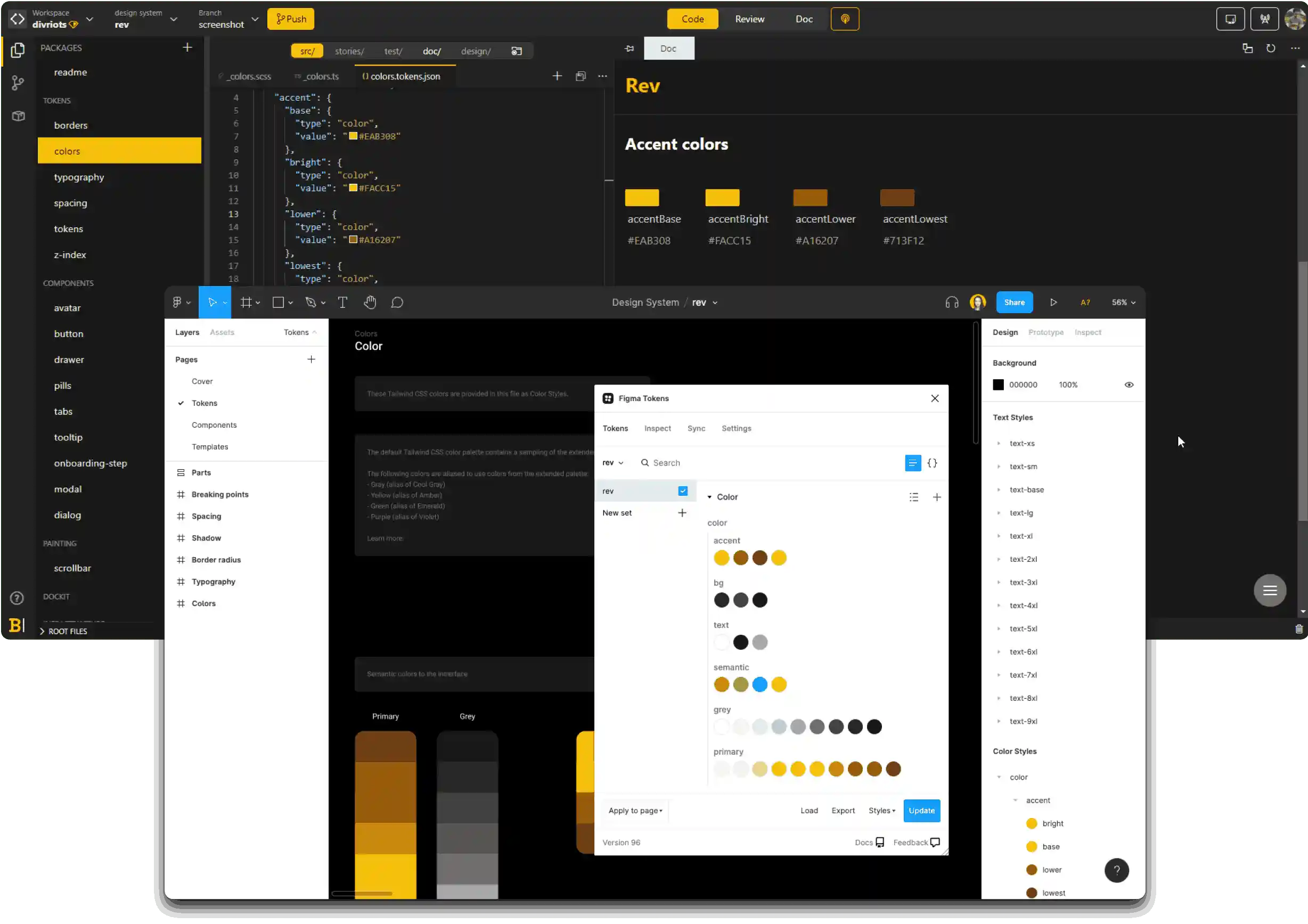
Works with Figma tokens plugin
Write your design tokens in Backlight, then bring them into Figma thanks to integration with the Figma tokens plugin.
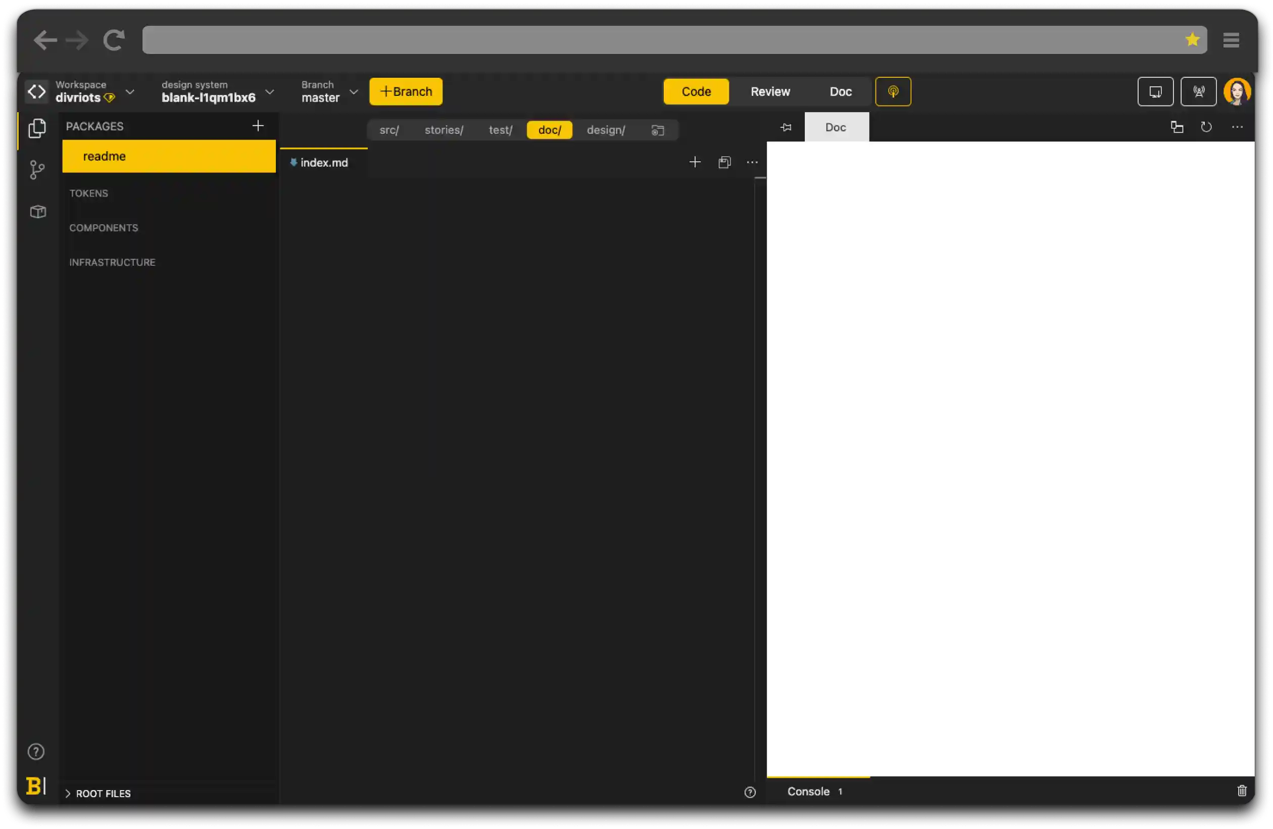
Documentation
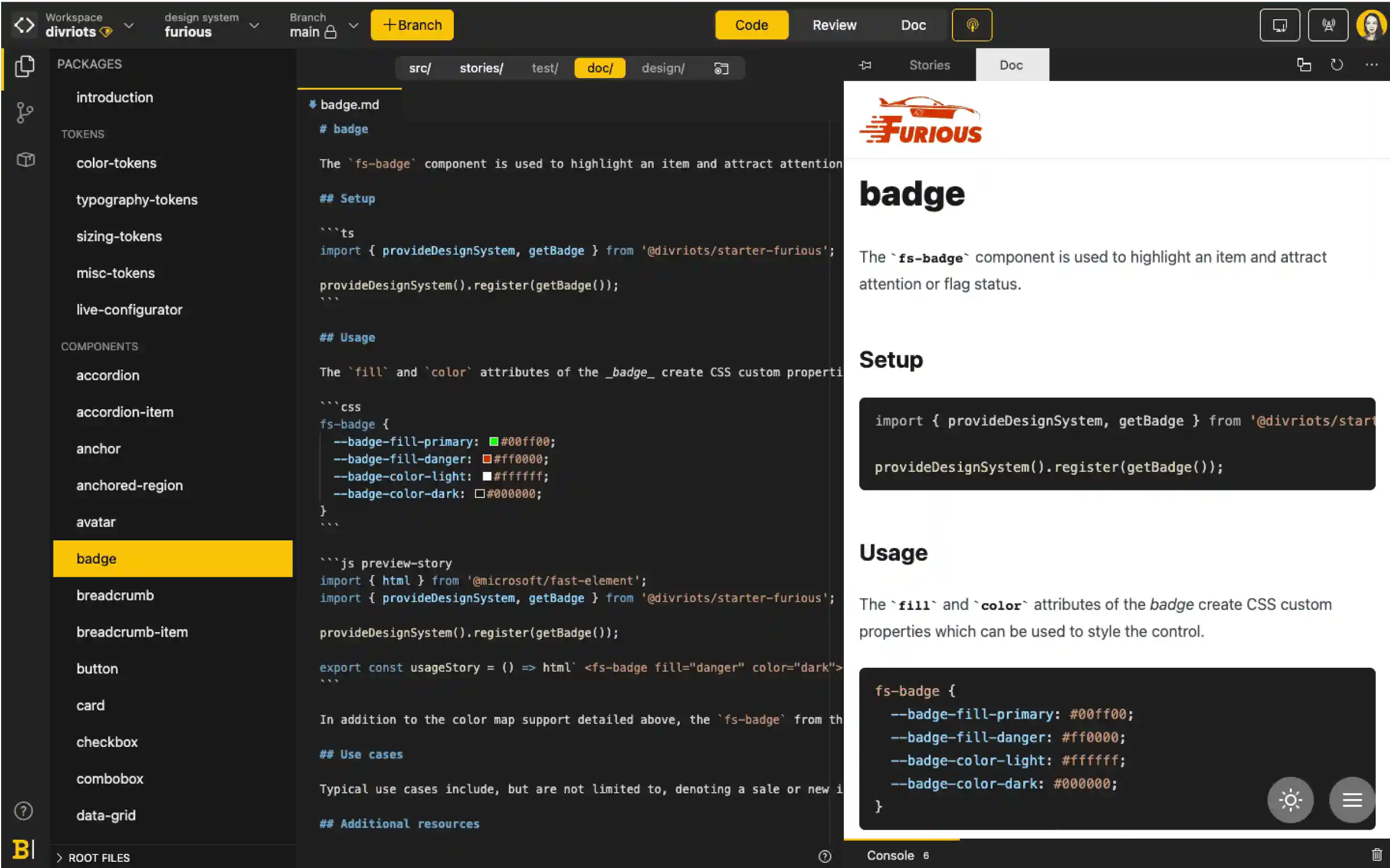
Markdown-centric documentation
We believe Markdown is best for writing technical documentation that embeds interactive components.
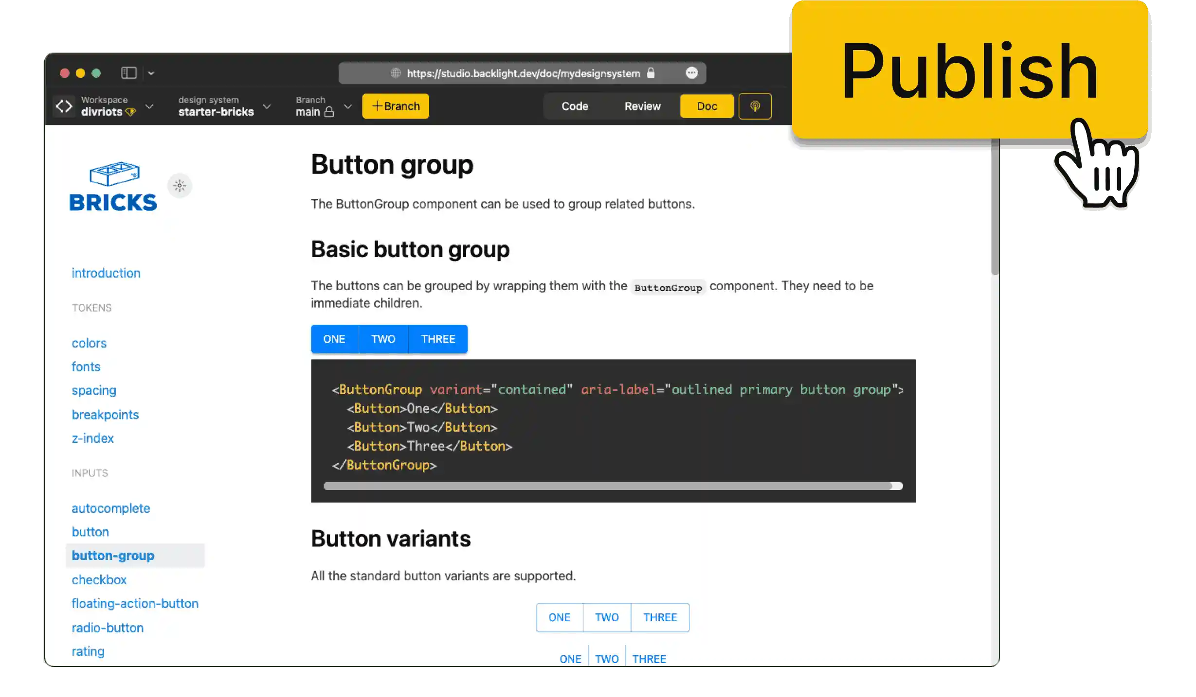
Edit documentation in real-time
Everyone can contribute directly to documentation with real-time editing and instant online preview.

All common documentation formats supported
Backlight has built-in support for Markdown, MDX2, MD Vue, MDsveX and Nunjucks for documentation.
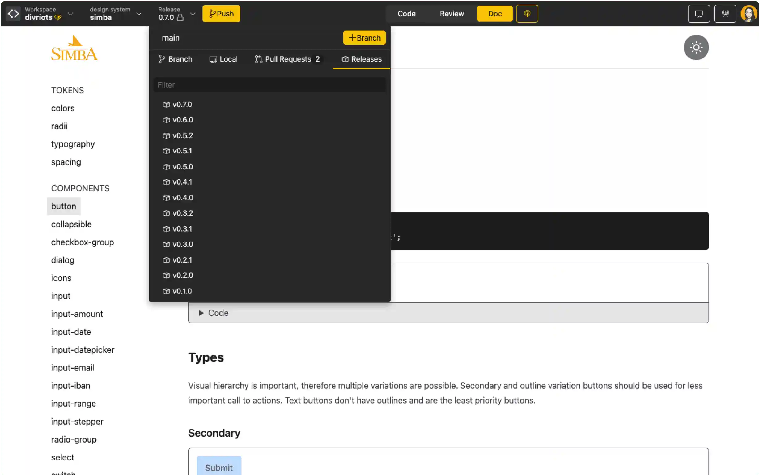
Automatically versioned with each release
Forget about manually updating documentation versions. With Backlight, your documentation is automatically tagged and versioned with each release.
Export your documentation
Export your documentation into static pages that you can host and serve anywhere.
Releases
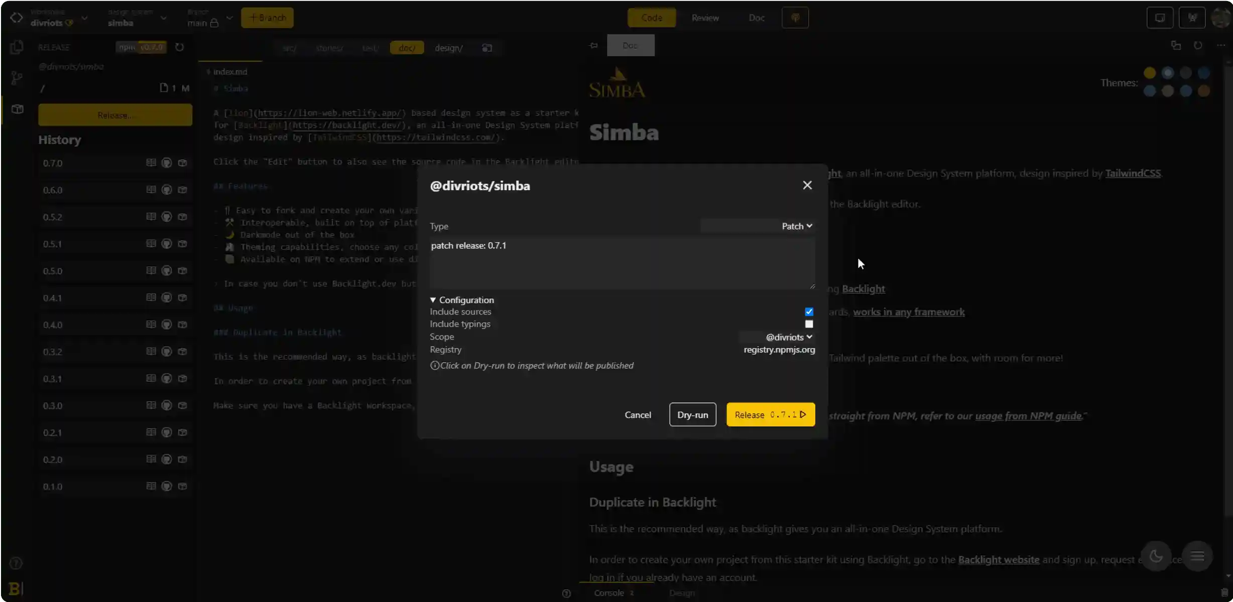
Publishes npm packages
Design systems are compiled, packaged and versioned on demand. Packages can be delivered to any npm registry like npmjs.org or GitHub packages.