Python Graph Gallery
👋 The Python Graph Gallery is a collection of hundreds of charts made with Python.
Graphs are dispatched in about 40 sections following the data-to-viz classification. There are also sections dedicated to more general topics like matplotlib or seaborn.
Each example is accompanied by its corresponding reproducible code along with comprehensive explanations. The gallery offers tutorials that cater to beginners to help kickstart their journey, as well as advanced examples that demonstrate the potency of Python in the realm of data visualization.
❤️ Love the project?
You can contribute on GitHub, share your feedback on LinkedIn, or join 10,000+ subscribers to the newsletter to get updates when new examples are published! 🔥
The biggest list of python chart examples
Within our collection, we cover every chart type imaginable to ensure we fullfil your data visualization needs. To streamline the process of finding your required chart, we meticulously classified all the examples under their respective chart types.
For each chart type, we kick off with a foundational tutorial that introduces its basic structure and utility. After mastering the basics, users can delve into our step-by-step guides on the most elementary customizations, ensuring your chart not only presents data but does so with an individual touch that caters to your specific requirements.

Violin

Density

Histogram

Boxplot

Ridgeline

Beeswarm

Scatterplot

Heatmap

Correlogram

Bubble

Connected Scatter

2D Density

Barplot

Spider / Radar

Wordcloud

Parallel

Lollipop

Circular Barplot

Table

Treemap

Venn Diagram

Donut

Pie Chart

Dendrogram

Circular Packing

Waffle

Line chart

Area chart

Stacked Area

Streamgraph

Candlestick

Timeseries

Map

Choropleth

Hexbin

Cartogram

Connection

Bubble

Chord Diagram

Network

Sankey

Arc Diagram

Edge Bundling

Colors

Interactivity

Animation

Cheat sheets

Caveats

3D

Statistics
Hunting the most beautiful Python charts
Explore our curated collection of the finest Python charts, handpicked for their superior design and accuracy. Go beyond the defaults with chart examples that are both visually stunning and instructive.
Accompanied by in-depth tutorials, this section will please seasoned professionals aspiring to elevate their craft. Featuring the finest charts on the web, we stay ahead of the curve, showcasing the latest tips, tricks, and advanced techniques in data visualization.
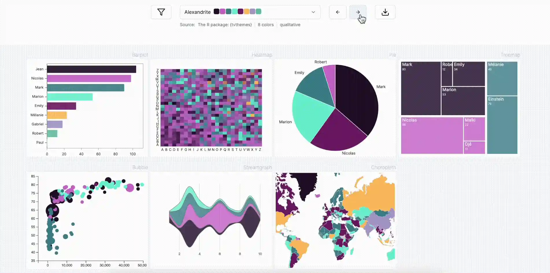
Palette color finder
Selecting optimal chart colors can be challenging and time-intensive. The pypalettes library simplifies this process by providing access to over 2,500 color palettes with a single line of code.
Additionally, the Python Graph Gallery features a dedicated page where you canbrowse all these palettes and preview their appearance on your charts.
Python Graphing with State-of-the-Art Libraries
The python graph gallery relies on the latest and most powerful charting libraries.
 Matplotlib
The foundation of Python visualization. Offers a wide array of customizable 2D plots and an extensive set of tools for creating intricate figures and charts.
 Seaborn
Built atop Matplotlib, Seaborn elevates data visualization by providing a higher-level interface and stunning default themes.
 Pandas
Beyond its powerful data manipulation capabilities, Pandas offers convenient plotting methods, enabling users to visualize data directly from DataFrame and Series objects.
 Plotly
Delivering interactive and browser-based visualizations, Plotly allows users to craft visually captivating charts, bridging the gap between static graphs and web-based interactivity.
 Plotnine
The Python Graph Gallery complements dataviz-Inspiration.com, a website featuring hundreds of my favorite data visualization projects.

Matplotlib Journey is an interactive online course crafted to transform you into a Matplotlib dataviz expert. It provides a clear, big-picture understanding of how data visualization works in Python, empowering you to grasp any example from the gallery with ease.