!!!###!!!title=Intelligent Chart Generation——VisActor/VMind tutorial documents!!!###!!!!!!###!!!description=This tutorial will provide you with a detailed introduction to the intelligent chart generation feature in VMind and provide some examples.There are many ways to generate charts, such as using professional BI visualization tools like PowerBI, Tableau, etc., to create visual charts using the fields of datasets; or you can directly use chart libraries like VChart, ECharts, MatPlotlib, etc., to draw charts by writing code. In addition, chart libraries like VChart, Echarts also provide simple and easy-to-use chart editors, where users can upload data and create charts.However, traditional chart generation methods also have some problems:- For programming beginners, they may not know how to write code, so they cannot use chart libraries to generate charts.- There are many types of charts, and the purpose of users' data display varies, which leads to different suitable chart types and corresponding field mappings. For non-professional users, they may not be able to accurately choose the chart type that best expresses their views.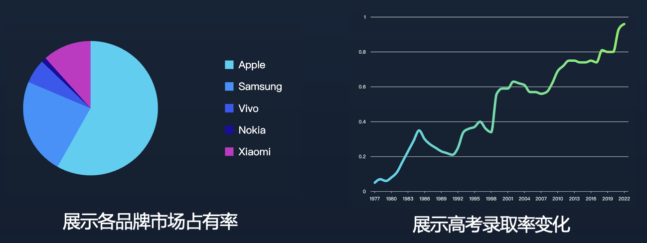- Users have different requirements for chart styles and animations, which often require certain design capabilities to meet. Designing a stunning chart is not easy, it requires design skills and aesthetic sense, which many users lack.These problems increase the threshold of data visualization creation and hinder non-professional users from creating visual works that meet their intentions.VMind's solution is to use the natural language understanding ability and public domain knowledge of large language models, recommend suitable chart types according to the user's data and display intentions, and map the fields to the appropriate visual channels to achieve intelligent chart generation, thereby reducing the threshold for users to perform data visualization.!!!###!!!
This tutorial will provide you with a detailed introduction to the intelligent chart generation feature in VMind and provide some examples.
There are many ways to generate charts, such as using professional BI visualization tools like PowerBI, Tableau, etc., to create visual charts using the fields of datasets; or you can directly use chart libraries like VChart, ECharts, MatPlotlib, etc., to draw charts by writing code. In addition, chart libraries like VChart, Echarts also provide simple and easy-to-use chart editors, where users can upload data and create charts.
However, traditional chart generation methods also have some problems:
For programming beginners, they may not know how to write code, so they cannot use chart libraries to generate charts.
There are many types of charts, and the purpose of users' data display varies, which leads to different suitable chart types and corresponding field mappings. For non-professional users, they may not be able to accurately choose the chart type that best expresses their views.
Users have different requirements for chart styles and animations, which often require certain design capabilities to meet. Designing a stunning chart is not easy, it requires design skills and aesthetic sense, which many users lack.
These problems increase the threshold of data visualization creation and hinder non-professional users from creating visual works that meet their intentions.
VMind's solution is to use the natural language understanding ability and public domain knowledge of large language models, recommend suitable chart types according to the user's data and display intentions, and map the fields to the appropriate visual channels to achieve intelligent chart generation, thereby reducing the threshold for users to perform data visualization.
generateChart
The generateChart function of VMind is a powerful tool that helps you intelligently generate charts. This function requires the following parameters:
userPrompt (string): The user's visualization intent (what information do you want to display with the chart)
fieldInfo (Array): Information about the fields in the dataset, including field names, types, etc.
dataset (Array): The original dataset used in the chart, which can be undefined. If the dataset is undefined, a spec template will be generated, and fillSpecTemplateWithData can be called later to fill the data into the spec template.
options: Optional, option parameters, including:
chartTypeList (ChartType[], optional): The list of supported chart types. If not undefined, the chart type will be selected from the types specified in this list.
enableDataQuery (boolean, optional): Decides whether to enable data aggregation during chart generation
colorPalette (Array, optional): Used to set the color palette of the chart
animationDuration (number, optional): Used to set the duration of the chart animation
theme (ChartTheme | string, optional): Sets the theme style of the final spec. By default, VMind uses a theme style with gradient colors. You can set VChart's general light or dark theme ('light' | 'dark') or a theme style that suits your usage scenario.
📢 Please note: The generateChart method will pass userPrompt and fieldInfo to the large language model for chart generation, but the detailed data in the dataset will not be passed.
In the process of generating the chart, VMind will first use the large language model, recommend a suitable chart type based on userPrompt and fieldInfo. Then, it will map the fields in fieldInfo to the visual channels of the chart, such as the x-axis, y-axis, color, size, etc.
VMind will add an entrance animation to the generated chart by default, so it will also return the duration of the chart animation time. If you don't want the chart animation, you can set spec.animation to false.
Here is an example of using generateChart to generate a chart:
import VMind from'@visactor/vmind';
const vmind = new VMind(options)
const userPrompt = 'show me the changes in sales rankings of various car brand';
const { spec, time } = await vmind.generateChart(userPrompt, fieldInfo, dataset);
You can learn how to create a VMind instance and the information of the parameters in options in Creating a VMind Instance, and get more information about fieldInfo and dataset in the Data Format and Data Processing section.
You can reprocess the spec to change the color, style, animation, etc. of the chart, or you can directly render the VChart chart:
<body><!-- Prepare a DOM with size (width and height) for vchart, of course you can also specify it in the spec configuration --><divid="chart"style="width: 600px;height:400px;"></div></body>
In userPrompt, you can describe what you want to show, which will be used as the basis for the large language model to recommend chart types; you can also pass in a color string array through options.colorPalette, which will be used as the color theme of the chart.
Parameter Explanation
userPrompt
The userPrompt parameter is used to describe the content you want to display with the dataset. This description will be passed to the large language model as a reference when generating the chart.
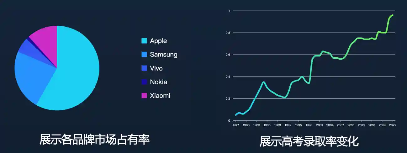
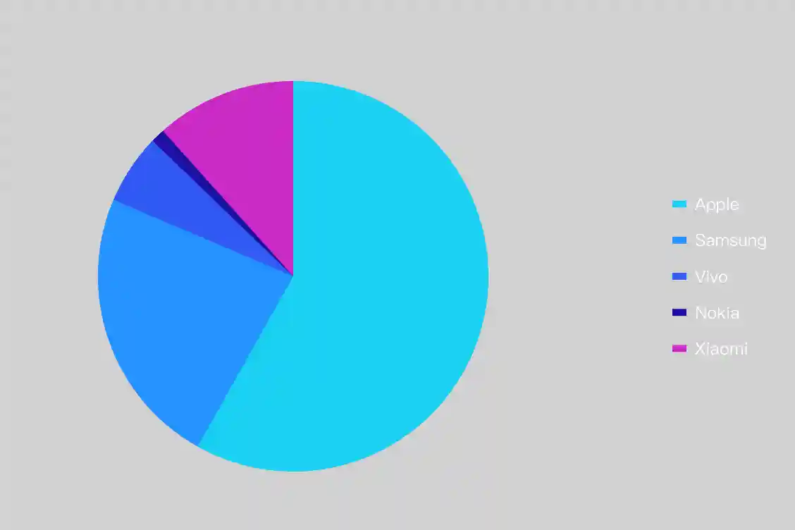
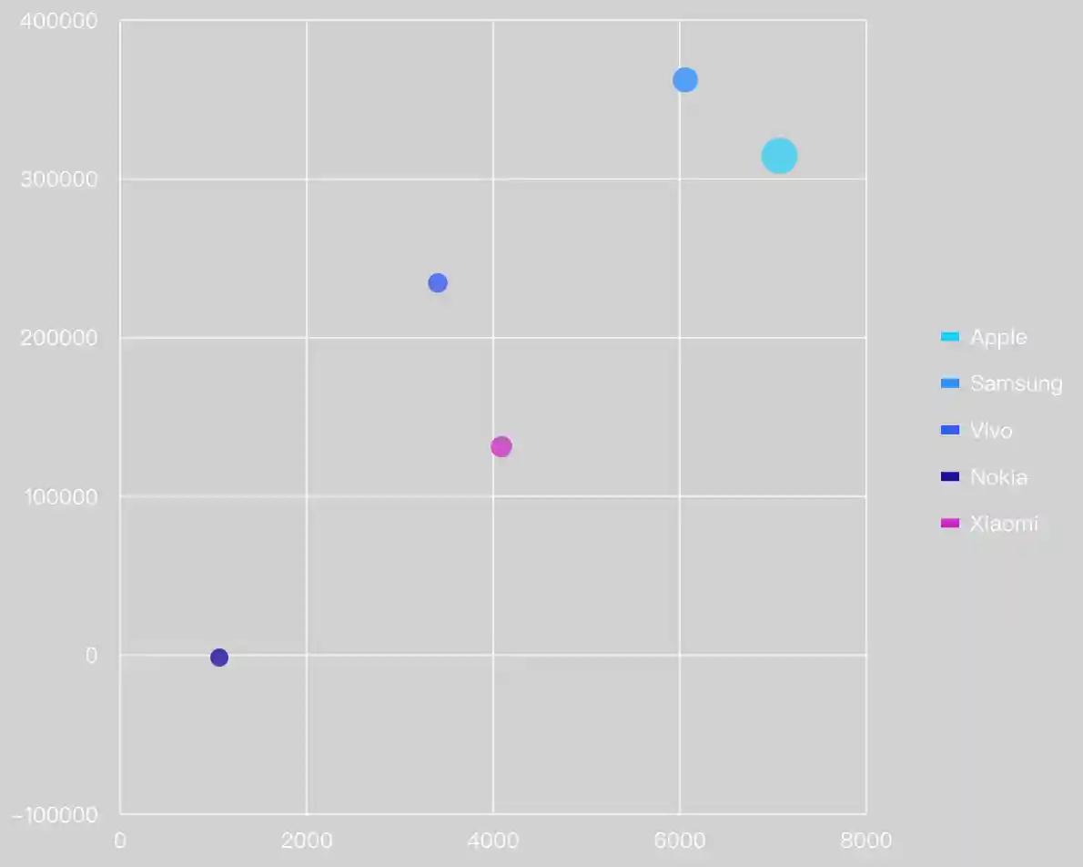
For example, suppose we have a mobile phone brand sales dataset, as shown below:
You can set userPrompt to Show the market share of each brand, and then call the generateChart method, which will generate a pie chart:
You can also set userPrompt to Show the net profit of each brand, and the generated chart will show the net profit of each brand:
You can even specify the chart type, such as setting userPrompt to Show the net profit of each brand, with a line chart, and the generated chart will be a line chart:
You can even specify the mapping of the chart's visual channels, such as setting userPrompt to Use the average price as the x-axis, net profit as the y-axis, brand name as the color, market share as the size of the point, and draw a scatter plot:
The power of VMind is that you can generate the chart you want by simply describing your needs in a sentence, without worrying about the details of chart generation. This is thanks to the public knowledge mastered by the large language model.
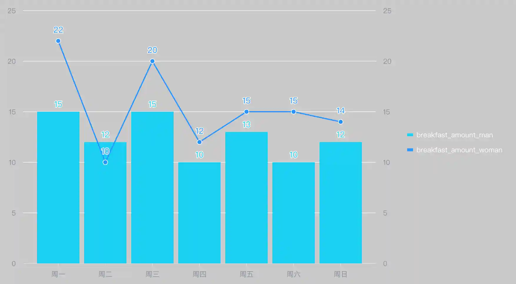
If your display intention is Show the difference in breakfast quantity between men and women, then a dual-axis chart will be generated:
VMind also supports dynamic bar charts (ranking bar), which is a narrative chart that shows the changes in the rankings of different types of data at different time points through constantly changing bar charts. To generate a dynamic bar chart, there must be a time field in the data.
For example, we have the following dataset and field information:
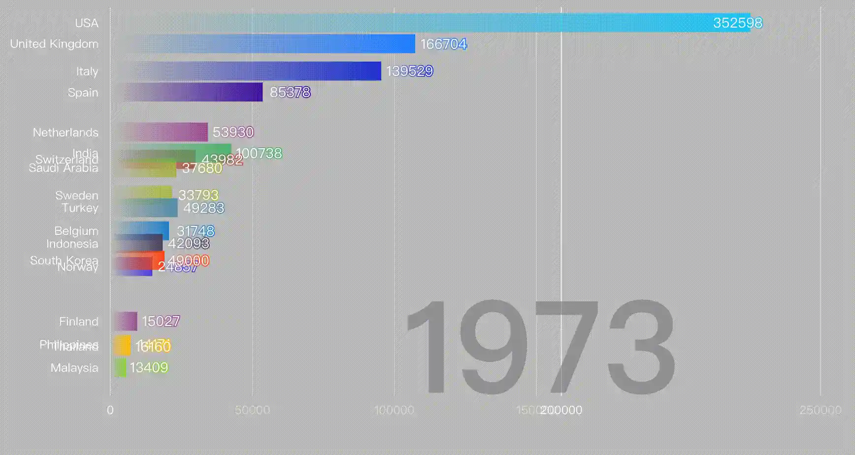
If userPrompt is Show me the change of the GDP rankings of each country, then a dynamic bar chart will be generated:
To make VMind generate a chart that meets your expectations, you need to describe your display intention and purpose as clearly as possible in userPrompt. In addition, you need to ensure that the field names in the dataset have certain semantics, or add field descriptions in the field information, please refer to the Data Format and Data Processing chapter for details.
With Empty User Prompt
If I have a chart, can I get a good chart generation result without manual input of intent, that is, without the input of userPrompt?
The answer is yes!
Currently, VMind supports generating a chart that the user is most likely to want to present on this data based on public domain knowledge and the content of the fields, even without user intent. Similarly, as mentioned earlier, this requires the data information and field information in the data to be as detailed and complete as possible. Imagine if the name and description of each field in my data are like 'a' | 'b' | 'c', it is obviously impossible to produce a high-quality chart, and this data itself has no special meaning because we do not understand what the fields represent.
Similarly, using the previous mobile phone brand sales dataset as a test, when we do not pass in userPrompt, the result is as follows:
options
enableDataQuery: Whether to enable intelligent data aggregation
In the Data Aggregation chapter, we have introduced that in order to meet the chart display requirements such as showing the top 10 departments with the most sales or showing the sales of various products in the northern region, we need to aggregate the data first, and then generate the chart. By default, the generateChart function will call dataQuery once during execution, using the same userPrompt, fieldInfo and dataset to aggregate the data, and then complete the subsequent chart generation steps with the aggregated data.
However, if you are sure that your data can meet the user's chart display requirements without further aggregation, filtering and sorting, you can turn off this process by setting enableDataQuery to false:
import VMind from'@visactor/vmind';const vmind = new VMind(options)
const userPrompt = 'show me the changes in sales rankings of various car brand';const { spec, time } = await vmind.generateChart(userPrompt, fieldInfo, dataset, {enableDataQuery: false}); // Set enableDataQuery tofalseto turn off data aggregation
This can reduce the process of calling the LLM once, reduce token consumption, and improve chart generation speed. For more information about VMind data aggregation, please refer to the Data Aggregation chapter.
chartTypeList: Limits the type of charts generated by VMind
VMind currently supports 25 common chart types in VChart:
Depending on the userPrompt and fieldInfo, these chart types may all be recommended by the large language model.
If you have new chart type requirements, feel free to propose them on our Github page.
If you want to limit the types of charts VMind generates during intelligent chart generation, you can do so by setting the options.chartTypeList array:
import VMind, {ChartType} from'@visactor/vmind';
// Limit to generating the following types of charts: bar charts, line charts, scatter plots, pie charts, word cloudsconst chartTypeList = [
ChartType.BarChart,
ChartType.LineChart,
ChartType.ScatterPlot,
ChartType.PieChart,
ChartType.WordCloud
]
const { spec } = await vmind.generateChart(userPrompt, fieldInfo, dataset, {chartTypeList});
In the above example, VMind will choose the chart type from bar chart, line chart, scatter plot, pie chart, word cloud for generation. If the user forcibly specifies an unsupported chart type in userPrompt, an error will be thrown.
colorPalette: set the chart palette
You can specify the palette used by the chart by setting options.colorPalette to an array of colors:
Generated VChart chart spec. If the dataset is empty, it will be a spec template without data included.
chartType
The type of chart generated, refer to the chartTypeList: limit the types of charts VMind generates section of this tutorial
cell
Field mapping in the chart, describes how the fields in the dataset are mapped to the different visual channels of the chart. Visual channels is an important concept in data visualization, which describes how to map the attributes of data to visual elements for intuitive understanding by humans. Common visual channels include color, shape, size, orientation, position, etc. For example, through visual channels, we can map different categories in the dataset to different colored graphics, or map numerical values to the size of graphics, thereby quickly understanding the characteristics and distribution of data.
The following shows an example of a chart being generated:
This indicates that VMind maps the product name field to the x-axis of the chart, the sales field to the y-axis, and the region field to the color of the column.
chartAdvistorRes
This result is the chart recommendation result derived based on the current data and field information through VMind's built-in rules. It is generated as a fallback when the model is set to Model.CHART_ADVISOR or the user's large model settings are incorrect and cannot obtain results. See: Rule-based Chart Generation
Generate spec template
Even without a specific dataset and with only data fields, we may need to generate a chart. For example, we can generate a chart based on the fields in the dataset before querying, and then execute related queries based on the type of chart and the fields it contains. In this case, when calling the generateChart method, there is no need to pass in a specific dataset, but to first generate a spec template, and then obtain the final spec used for chart rendering through the fillSpecWithData method later.
The following shows how to use the generateChart method to generate a spec template:
At this point we have obtained the chart spec, field mapping cell and chart type chartType generated by VMind. We then call the fillSpecWithData method to fill in the data in the spec template:
// Fill in data in the templateconst dataset = [
{
"Product Name": "Coke",
"region": "south",
"Sales": 2350},
{
"Product Name": "Coke",
"region": "east",
"Sales": 1027},
{
"Product Name": "Coke",
"region": "west",
"Sales": 1027},
{
"Product Name": "Coke",
"region": "north",
"Sales": 1027},
...
]
const spec = vmind.fillSpecWithData(spec, dataset)
The final generated spec can be used for rendering VChart charts.