Angular Scheduler | Modern Event Calendar Component | Syncfusion
Overview
The Angular Scheduler (or Angular Event Calendar), is a fully featured event calendar component that helps users manage their time efficiently. It facilitates easy resource scheduling and the rescheduling of events or appointments through editor pop-ups, drag and drop, and resizing actions.
The Angular Scheduler loads data on demand by default to reduce the transfer and load times. Proper field mapping is mandatory while binding Scheduler to data sources with different field names.
Bind data seamlessly with various local and remote data sources such as JSON, OData, WCF, and RESTful web services with the help of a data manager.
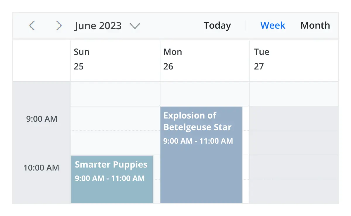
There are several different built-in view modes available: day, week, workweek, month, agenda, month-agenda, year, and timeline. With a variety of view-specific variables, you can customize each view.
Easily configure recurring events to repeat on a daily, weekly, monthly, or yearly basis with integrated recurrence options.
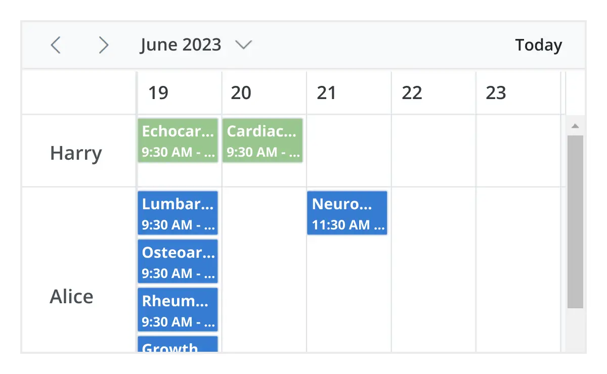
Multiple resources and grouping
To group resources according to multiple factors, the Angular Scheduler offers a wide range of flexible options. It also covers scheduling timelines and grouping appointments by resource and date.
Scheduler has a highly responsive layout and an optimized design for desktops, touch-screens, and smart phones. It works well on all mobile phones that use iOS, Android, or Windows OS.
Cutting edge design with 5+ built-in themes such as Fluent, Tailwind CSS, Bootstrap, Material, Fabric, and more. Utilize the online Theme Studio tool to customize themes of Scheduler easily.
Globalization and localization
Enables users from different locales to use the Scheduler by formatting dates, currency, and numbering to suit their preferences.
Smart Planning with AI-Driven Scheduler
Experience smarter scheduling with our AI-driven Scheduler. Just type “Team catch-up every Friday at 10 AM”, and it auto-organizes your events, resolves conflicts, and adapts to your workflow. Your calendar doesn’t just track time—it helps you make the most of it.
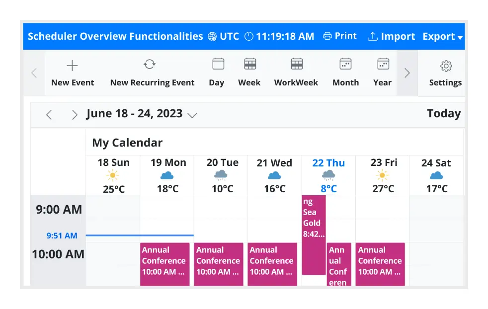
Angular Scheduler Code Example
Easily get started with the Angular Scheduler using a few simple lines of HTML and TS code as demonstrated below. Also, explore our Angular Scheduler Example that shows you how to render and configure the Scheduler.
<ejs-schedule [selectedDate]="selectedDate" [eventSettings]="eventSettings">
</ejs-schedule>
//app.component.ts
import { Component } from '@angular/core';
import { EventSettingsModel, DayService, WeekService, WorkWeekService, MonthService, AgendaService } from '@syncfusion/ej2-angular-schedule';

@Component({
  selector: 'app-root',
  templateUrl: 'app.component.html',
  providers: [DayService, WeekService, WorkWeekService, MonthService, AgendaService]
})

export class AppComponent {
  public selectedDate: Date = new Date(2022, 1, 20);
  private data: Object[] = [
    {
      Id: 1,
      Subject: 'Scrum Meeting',
      Location: 'Office',
      StartTime: new Date(2022, 1, 12, 9, 30),
      EndTime: new Date(2023, 1, 12, 10, 30),
      RecurrenceRule: 'FREQ=WEEKLY;BYDAY=MO,TU,WE,TH,FR;INTERVAL=1'
    },
  ];

  public eventSettings: EventSettingsModel = { dataSource: this.data };
}

//app.module.ts
import { ScheduleModule } from '@syncfusion/ej2-angular-schedule';

import { CommonModule } from '@angular/common';
import { BrowserModule } from '@angular/platform-browser';
import { NgModule } from '@angular/core';

import { AppComponent } from '../app.component';

@NgModule({
  declarations: [AppComponent],
  imports: [CommonModule, ScheduleModule, BrowserModule],
  providers: [],
  bootstrap: [AppComponent]
})
export class AppModule {}
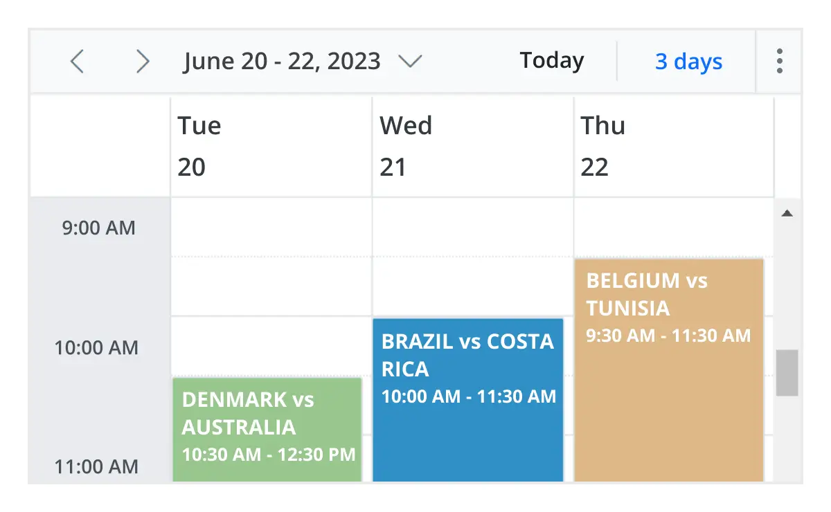
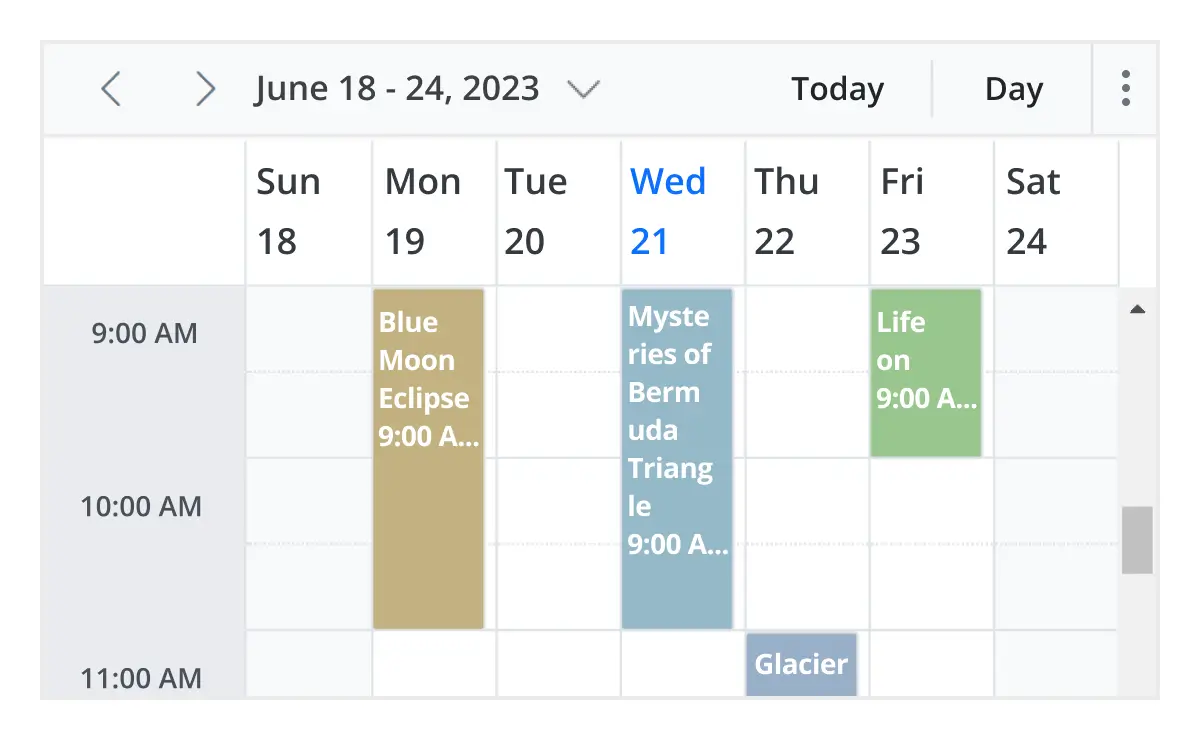
Multiple scheduler views
A wide variety of built-in view modes are available: day, week, workweek, month, agenda, month-agenda, year, and timeline. Easily configure each individual view with different, view-specific options.
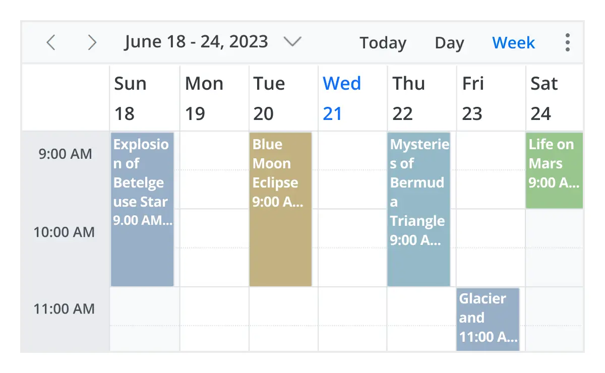
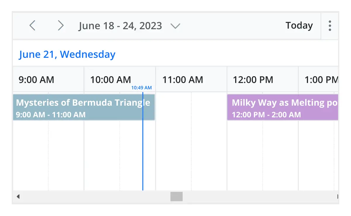
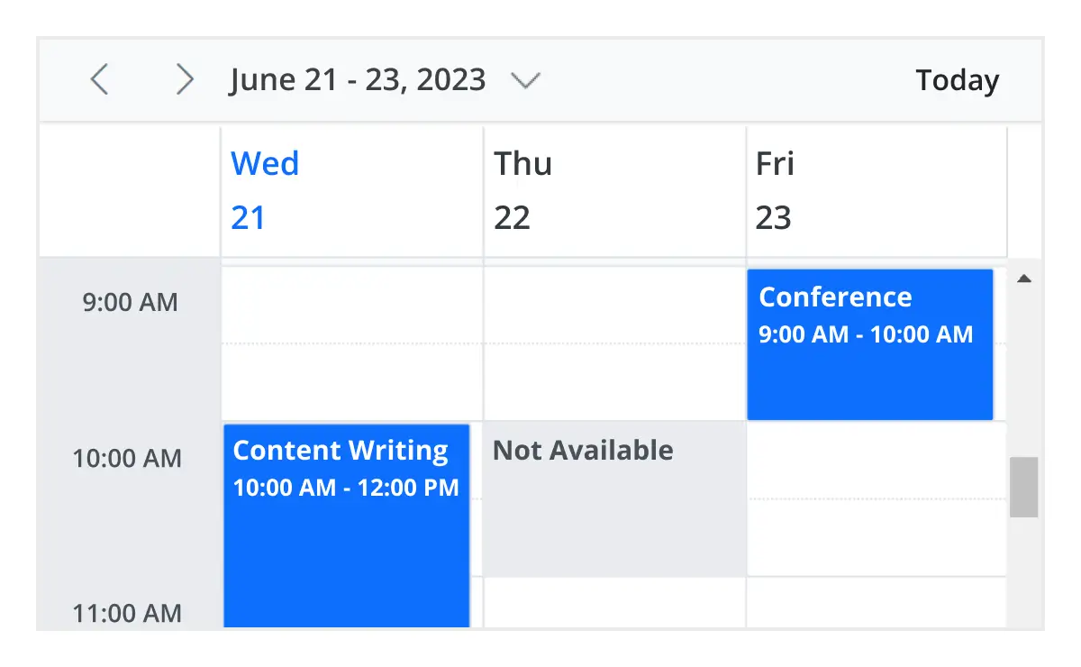
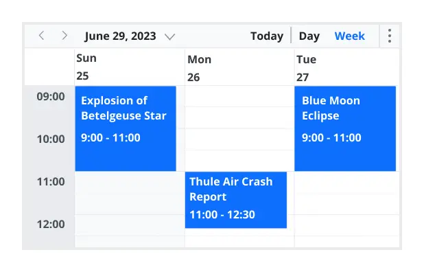
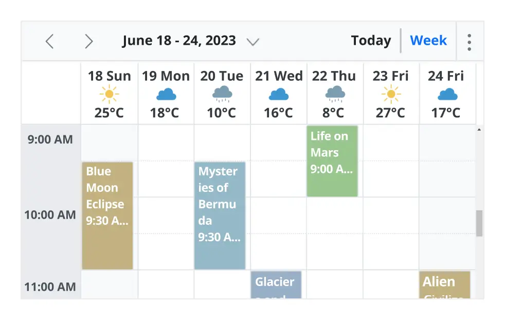
Day, week, and workweek views
Display appointments for a single day or across multiple days.
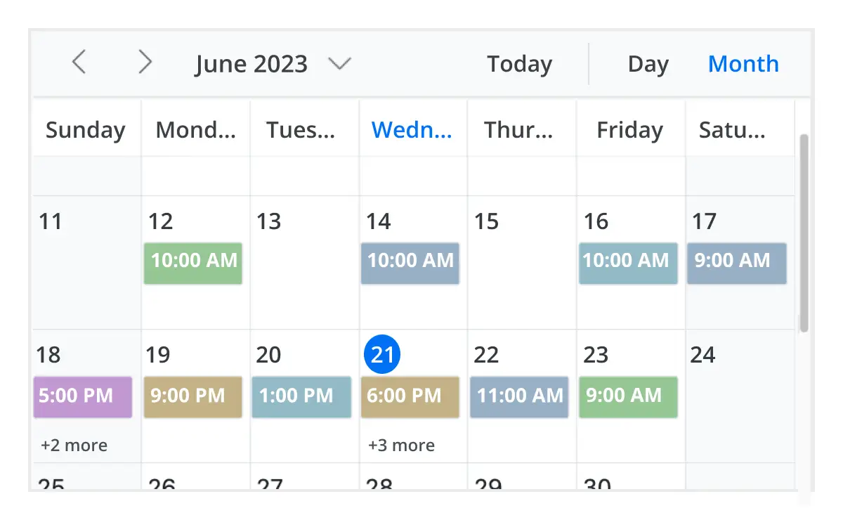
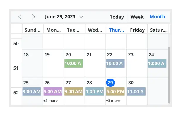
Month view
Display events and appointments on a single day or multiple days for an entire month.
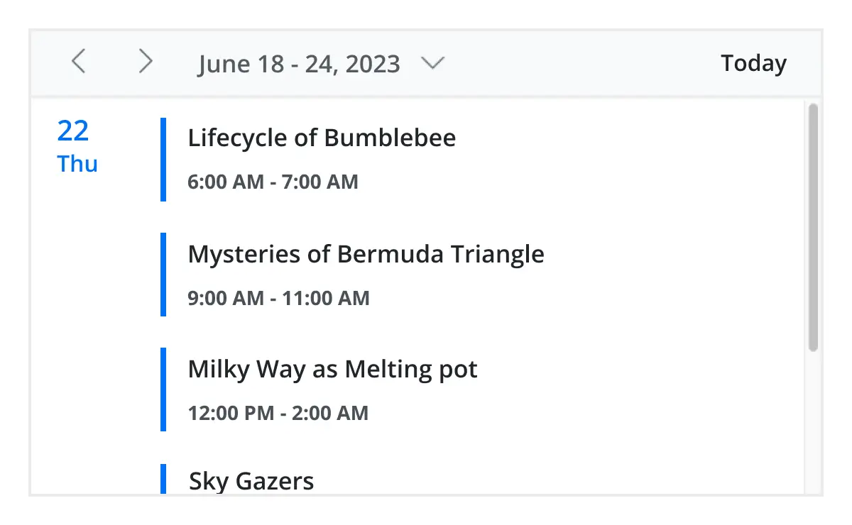
Agenda view
Load events virtually and display them as a list in a sequential order grouped by day. An option exists to specify the number of days to load initially in the agenda view.
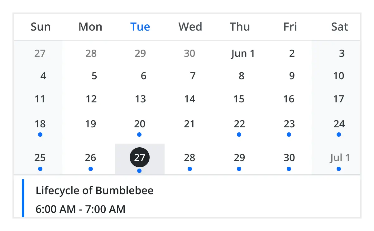
Month agenda view
Display the calendar layout and the events of the currently selected date. A round indicator at the bottom of a date shows the presence of one or more events on that day.
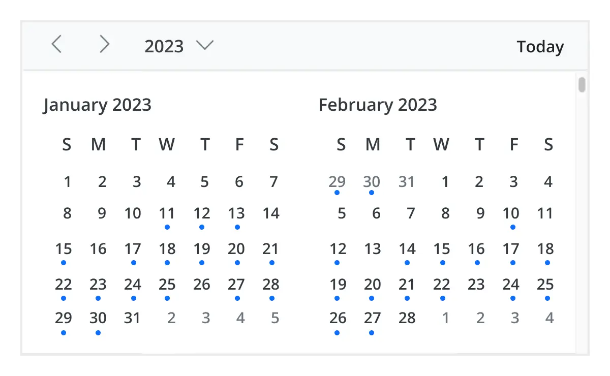
Year view
Year view displays all the months of a particular year in a calendar view format. In that calendar view, dates containing events and appointments are highlighted with dots placed under the individual date. When you click on the date, the event pop-up will be displayed and the events will be listed.
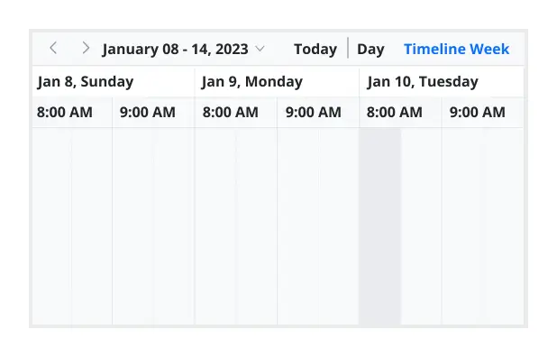
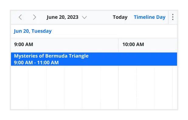
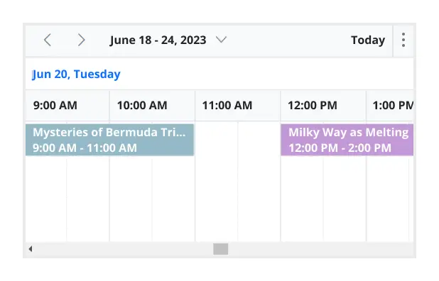
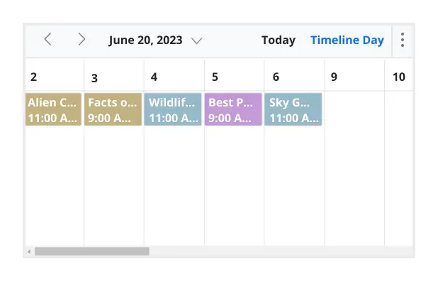
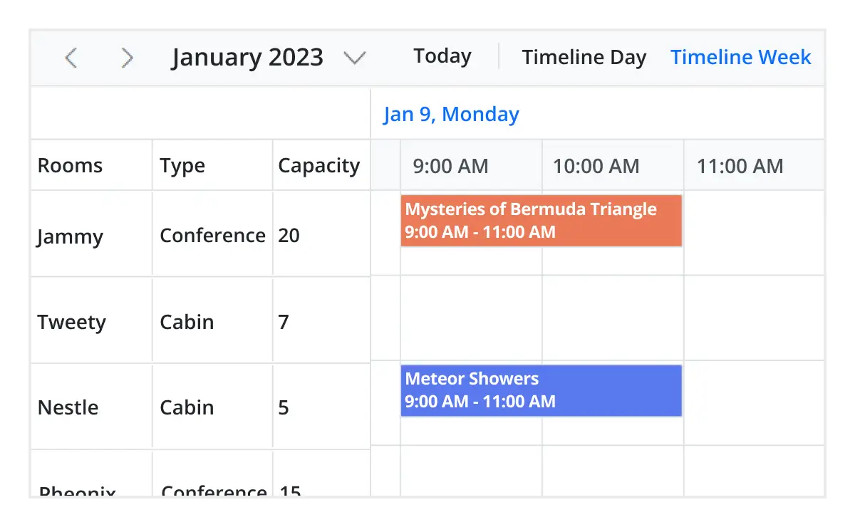
Timeline views
Angular provides five built-in timeline views: timeline day, timeline week, timeline workweek, timeline month, and timeline year. Each view displays events accurately across a horizontal time axis for a single day or multiple days.
To provide better performance, timeline views load resources, events, and appointments virtually on every scroll action.
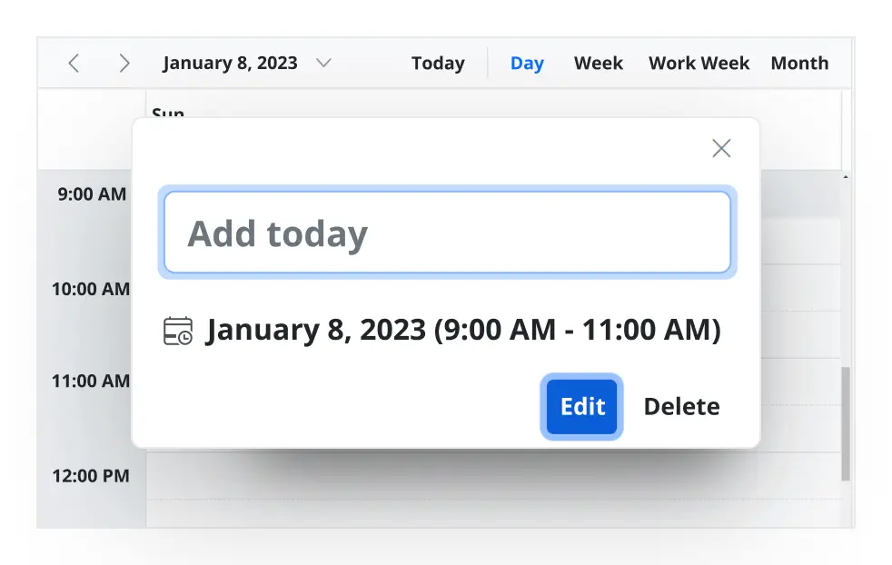
Inline appointment
With this feature enabled, users can create and edit appointments inline through a single click on the scheduler cells or on the existing appointment’s subject. Pressing Enter after the new subject text is typed in the inline text box will update and save the appointment appropriately.
Advanced event-handling options
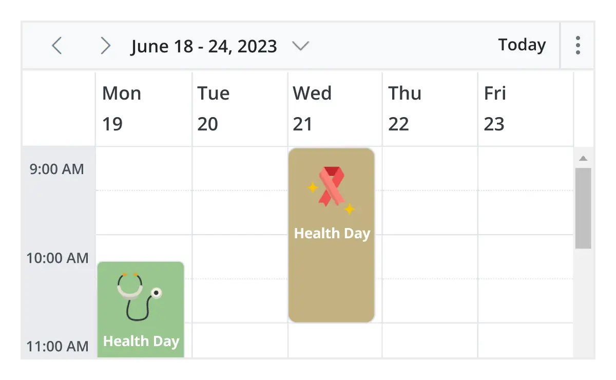
The Angular Event Calendar provides clear, vibrant, exact representations of events and appointments across the Scheduler timeline, based on their assigned time duration.

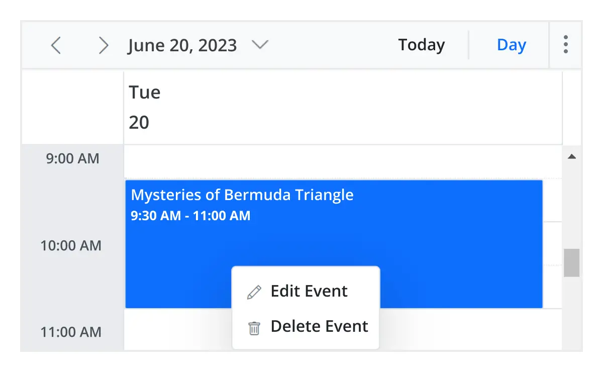
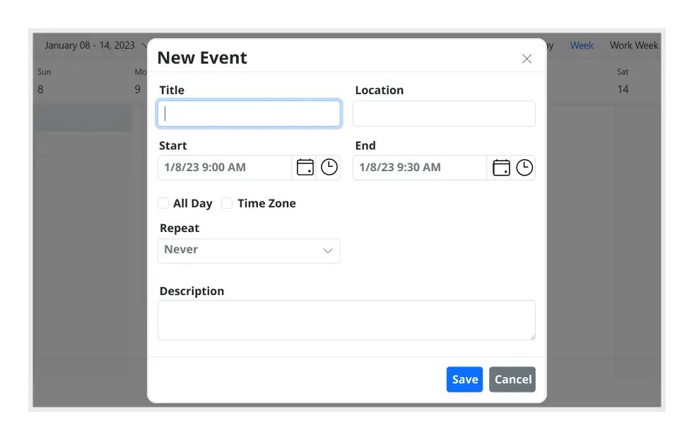
Add and edit capabilities
There is built-in support for better event handling, such as easier appointment creation and editing using the default event editor or through intuitive drag-and-resize actions. In addition, you can also add custom data fields to both the events and resource data source.

Multi-event selection
Easily select multiple events at once by pressing and holding the Ctrl key while clicking on events. On mobile devices, do the same by tapping and holding an event, and continue selecting by single-tapping other events. After successfully selecting events, delete or reposition them simultaneously.

Tooltip
The customizable tooltip displays event information while the mouse pointer is hovering over the event. Do the same on mobile devices by tapping and holding an event.

Appearance customization
Change the look and feel of Angular Scheduler events and appointments by customizing their default appearance and style using any HTML or CSS.

Time zone
Regardless of the system time zone, the Angular Event Calendar supports setting the required time zone for the control itself, as well as events.

Clipboard
The Angular Scheduler supports clipboard functionality, allowing users to manage events efficiently. Users can copy selected events using the Ctrl+C shortcut, cut events with Ctrl+X, and paste events into different time slots using Ctrl+V.
Adaptive rows
A built-in option has been added to the Angular Event Calendar to automatically increase the height of the rows in month and timeline views when new concurrent events or appointments are added.
Real-time data synchronization
Real-time appointment data accurately synchronizes with our Angular Scheduler.
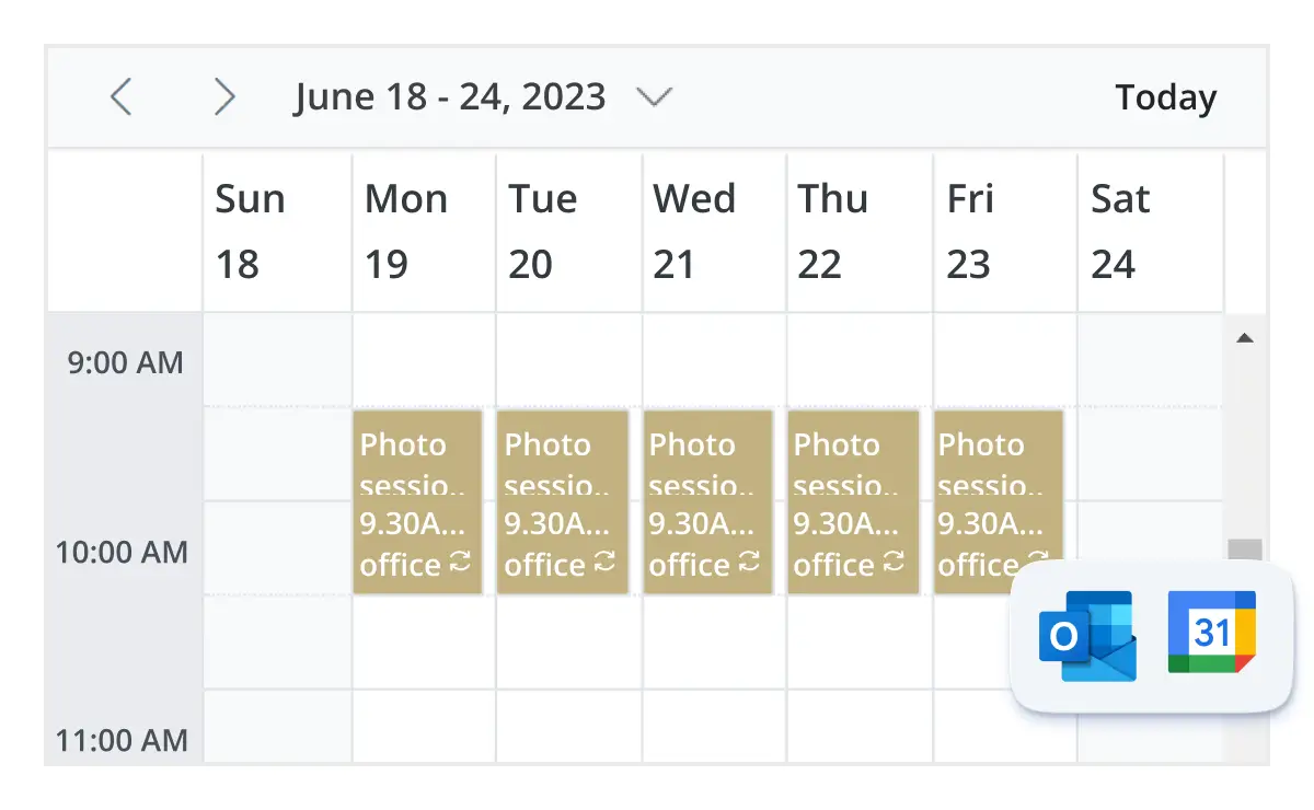
Outlook and Google Calendar integration
Easily synchronize events between our Angular Event Calendar and Google or Outlook Calendar via the Google Calendar API or Microsoft Outlook’s object library.
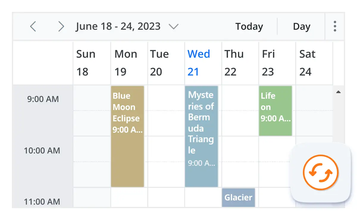
Real-time updates
Bidirectional data communication conveys the server-side appointment updates made on Scheduler to all the connected clients through SignalR.
Feature-rich calendar options
The Angular Event Calendar inherits almost all the calendar-specific features, such as first day of the week and timescale.
First day of the week
Customize the first day of the week, which defaults to Sunday, as per the default locale. You can utilize this option for individual views, also.
Custom start and end hours
Display the event scheduler layout with specific time durations by hiding the unwanted hours.
Flexible timescale
Use customizable timescale options to view a timeline of events clearly and set a different duration.
Working time
The active cells of the scheduler (displayed in white) visually represent the work days and working hours.
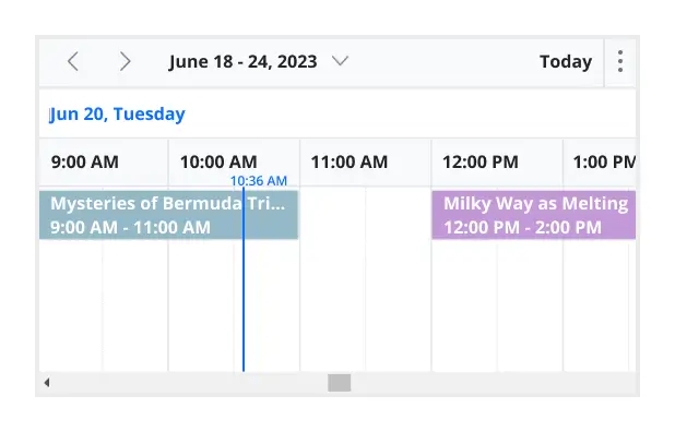
Highlighting current time
Indicate the current date with a highlighted date header. Mark accurately the current time on all views.
Hiding weekend days
Hiding weekend days from the Scheduler allows you to display only working days across all views.
Week number display
Display the week number of the current date range beside the date header in day, week, and workweek views. Also display the week number in the month view as the first column. The week number is determined by the first day of the week and week rules (first day or first full week, or first four day week).
Time mode
The Scheduler control supports both 12-hour and 24-hour time formats.
Completely customizable UI
Customize the appearance of any part of the Scheduler interface using HTML and CSS styles.
Change the default appearance of the header bar by adding any kind of CSS, custom text, or image.
Complete Scheduler UI
A built-in client-side event allows the end users to customize any part of the Scheduler user interface.
Add custom items to the default header bar options. You can hide or show common header bar options.
Scheduler cells
Out-of-the-box template options allow you to easily customize the cells by adding any kind of text, image, or CSS.
Quick pop-ups
Easily customize pop-ups that open when single-clicking on cells, events, or appointments with your own UI or template design.
Open event editor externally
The Angular Event Calendar offers a built-in method to open the default event editor window programmatically.
User-friendly interactions
The modern and trendy UI design of the Angular Scheduler makes the user interactions simpler and more efficient.
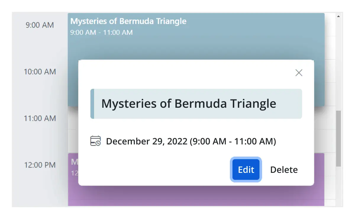
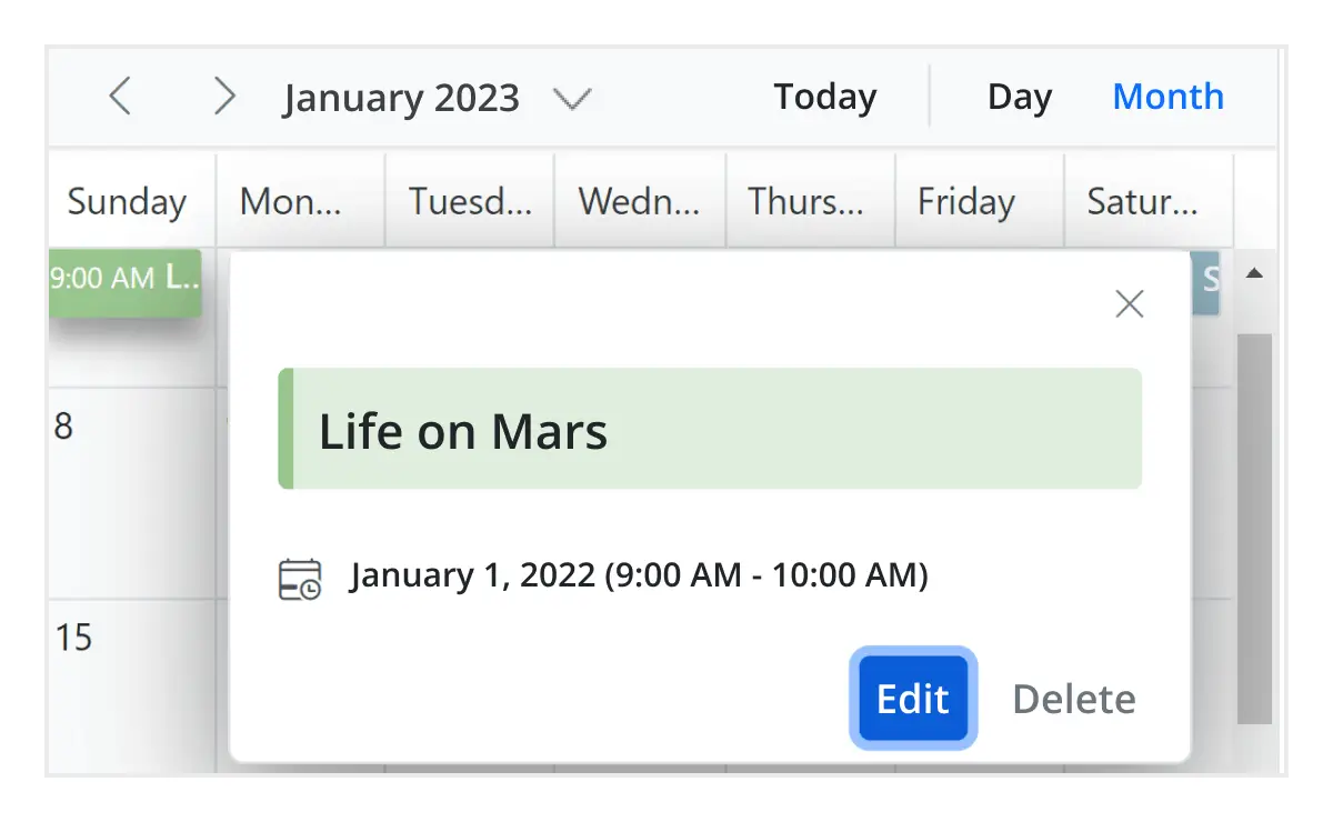
Quick event overview
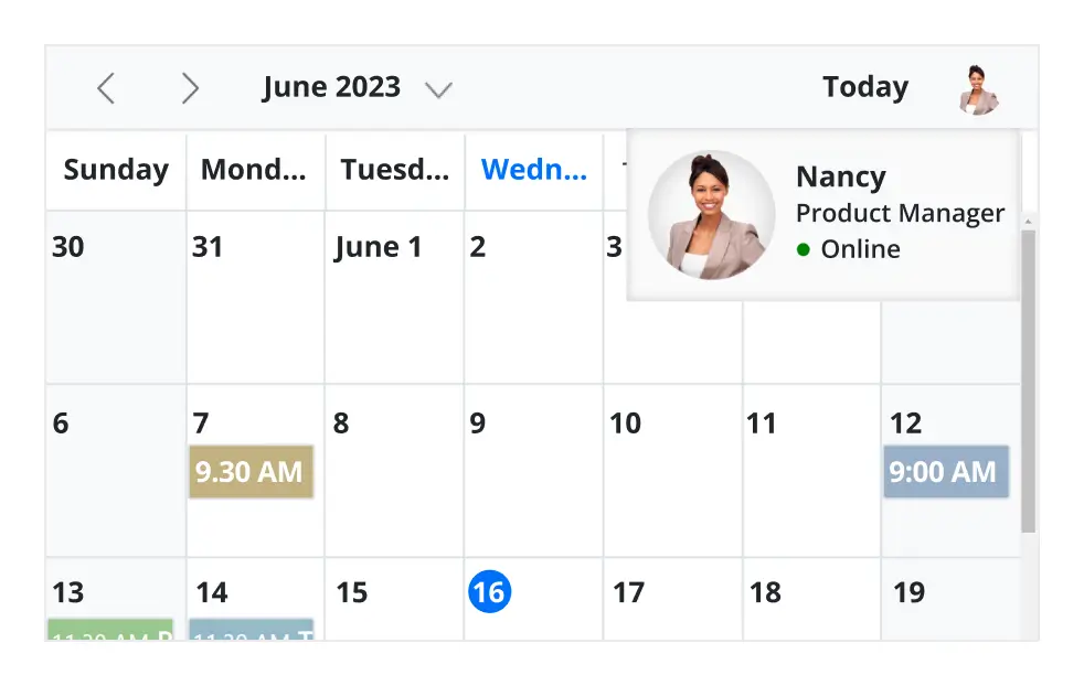
Clicking or tapping on events displays their important details, such as subject and time, along with edit and delete options.
Cell selection
Click and drag the pointer over the Scheduler cells for multiple-cell selection. You can do the same with keyboard shortcuts.
Event container
Clicking on the text indicator (+n more) in month and timeline views will open an event container listing all the hidden event and appointment details of a day.
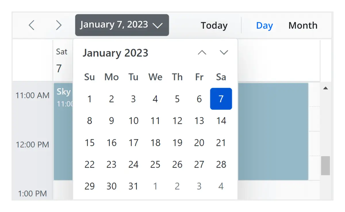
Quick navigation
The Angular Scheduler provides an intuitive way to navigate back and forth among the date ranges using an inline calendar, and also to navigate between different view modes.
Real-time applications
Many real-time applications use schedulers as an integral part, thus serving different purposes based on the project type. Some of the active applications are: Fare Calendar, Meeting Room Calendar, Doctor’s Appointment planner, Hotel Room reservation.
Interactive features
The Angular Scheduler allows users to export its events in two ways: as an Excel file or as an ICS file.

Export to Excel
The Angular Scheduler allows you to export all its events to an Excel document by default. It also provides additional customization options to export custom event data collections.

Export and import ICS
The Angular Event Calendar supports exporting all its event data to iCal format, and it supports importing events from an iCal file into the Scheduler.

Developer-friendly APIs
Developers can have full control over the UI and behavior of the event calendar through its built-in, developer-friendly APIs. It allows you to customize even the complex Scheduler functionalities with ease.
Accessibility
The Angular Scheduler component is easily accessed by screen readers. Complete keyboard interaction support has also been provided.

Completely accessible
The Angular Scheduler component has complete WAI-ARIA accessibility support. The Scheduler UI includes high-contrast visual elements, giving visually impaired people the best viewing experience. Also, valid UI descriptions are easily accessible through assistive technologies such as screen readers.

Interactive keyboard
Various keyboard shortcuts are available to perform almost all the Scheduler actions, such as multiple cell or event selection and navigating to other views.

Right to left (RTL)
Render the event scheduler following the proper right-to-left conventions.

Transform your applications today by downloading our free evaluation version
Syncfusion Angular Scheduler Resources