Angular TreeGrid | Material Tree Table | Syncfusion
Overview
The Angular TreeGrid is a feature-rich control used to visualize self-referential, hierarchical data effectively in a tabular format (a tree-like structure). Its rich feature set includes many functionalities: data binding, virtualization, editing, sorting, searching, filtering, infinite scrolling, paging, frozen rows and columns, exporting to multiple formats, aggregating rows, and more.
Display data hierarchically, its optimized design provides high performance and load millions of records in just a few seconds.
Bind data seamlessly with various local and remote data sources such as JSON, OData, WCF, and RESTful web services with the help of a data manager.
Angular TreeGrid is designed to visualize self-referential and hierarchical in a tabular format. This in turns displays the relationship between parent and child records.
The Angular Tree Grid performs create, read, update, and delete operations (CRUD) with observable data. It edits with an Array of JSON or remote data service with the data manager.
The Tree Grid has a highly responsive layout and an optimized design for desktops, touch screens, and smart phones. It works well on all mobile phones that use iOS, Android, or Windows OS.
Using templates, users can create a custom UI in the Angular Tree Grid based on their application need using a wide range of template options.
Cutting edge design with 5+ built-in themes such as Fluent, Tailwind CSS, Bootstrap, Material, Fabric, and more. Utilize the online Theme Studio tool to customize themes of Angular Tree Grid easily.
Globalization and localization
Enables users from different locales to use the Tree Grid by formatting dates, currency, and numbering to suit their preferences.
Angular Tree Grid Code Example
Easily get started with the Angular Tree Grid (Tree Table) using a few simple lines of HTML and TS code example as demonstrated below. Also explore our Angular Tree Grid Example that shows you how to render and configure a Tree Grid in Angular.
<ejs-treegrid [dataSource]='data' [treeColumnIndex]='1' height='350' childMapping='subtasks'>
<e-columns>
<e-column field='taskID' headerText='Task ID' textAlign='Right' width=90></e-column>
<e-column field='taskName' headerText='Task Name' textAlign='Left' width=180></e-column>
<e-column field='startDate' headerText='Start Date' textAlign='Right' format='yMd' width=90><e-column>
<e-column field='duration' headerText='Duration' textAlign='Right' width=80></e-column>
</e-columns>
</ejs-treegrid>
import { Component, OnInit } from '@angular/core';
import { sampleData } from './datasource';

@Component({
    selector: 'ej2-treegrid-container',
    templateUrl: 'default.html'
})
export class DefaultComponent implements OnInit {
    public data: Object[] = [];

    ngOnInit(): void {
        this.data = sampleData;
    }
}
Skeleton loading indicator
The Tree Grid shows the shimmer effect as a loading indicator while fetching data and binding it to the tree grid during initial rendering, refreshing, or after performing grid actions like sorting, filtering, and more. The Tree Grid offers two types of effects, spinner and shimmer.


Column
Columns define the schema of a data source in Angular Tree Grid. Features include formatting, column definitions, text wrapping, column chooser, column menu, column reordering, and other important features.
Paging
Through paging, a segment of data can be viewed from the assigned data source. The Angular Tree Grid offers built-in pager UI with options to customize its entire UI. It also has an on-demand paging mode for effective data retrieval from remote web services.


Sorting
The Angular Tree Grid allows users to sort a column by simply clicking on the header. A Ctrl + header click performs multi-sorting. Sort data in either ascending or descending order.
Filtering
Filtering helps view specific or related records that meet a given filtering criteria. It supports various filter types that include powerful Excel-like filter. The Angular Tree Grid filter allows users to choose appropriate filter types, define their own custom filtering logic, and customize the filtering UI based on their application needs. Filtering with related parent or child records can be defined.


Selection
Angular Tree Grid allows selecting rows or cells. One or more rows or cells can also be selected by holding Ctrl or Command, or programmatically.
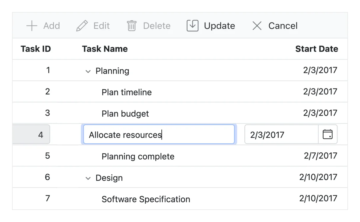
Editing
The Angular TreeGrid provides full support to create, read, update, and delete operations (CRUD). In addition to built-in editor components to edit a particular column value, using template support users can create custom editor components that suit their application needs. It performs editing operations with JSON collection or remote data service with the help of data manager.


Aggregation
Aggregates for column values can easily be displayed using the aggregate feature. Aggregates can be customized to show their value in every hierarchy with a set of predefined summary types.

Angular TreeGrid component allows you to set tooltips for treegrid cells. Hover over the tree nodes to display tooltip text.

Additional features

Row height
Row height is a major factor when displaying the number of records in the view port, and it is effortlessly customizable based on the application’s UI requirement. It is also possible to set row height conditionally.

Copy to clipboard
The clipboard provides an option to copy selected rows or cells’ data into the clipboard. Use Ctrl+C and Ctrl+Shift+H key combinations to copy data with and without headers, respectively.

The context menu improves user action with Angular Tree Grid using popup menu. It appears when the cell, header, or pager is right clicked. In addition to built-in default menu items, it allows you to add custom context menu items.

Width and height
Allows changing the Angular Tree Grid size by setting the width and height properties. Horizontal and vertical scrollbars will appear when the content overflows the Angular Tree Grid element. For the Angular Tree Grid to fill its parent container, the user must simply set the height and width to 100%.

Stacked headers allow grouping and visualizing column headers in a stacked manner. There is no limit to the number of columns that can be stacked. Allows the user to perform all Angular TreeGrid actions, even when the columns are stacked.
Accessibility

Keyboard navigation
The Tree Grid ensures that every cell is keyboard accessible. Major features like expanding or collapsing child rows, sort, select, and edit can be performed using keyboard commands alone; no mouse interaction required. This helps in creating highly accessible applications using this component.

Screen reader
The Angular Tree Grid has complete WAI-ARIA accessibility support. Its UI includes high-contrast visual elements, helping visually impaired people have the best viewing experience. Also, the valid UI descriptions are easily accessible through assistive technologies such as screen readers.

Right to left (RTL)
Right-to-left rendering allows displaying the text and layout of the Angular Tree Grid from right to left. This improves the user experience and accessibility for RTL languages.

Transform your applications today by downloading our free evaluation version
Syncfusion Angular Tree Grid Resources