CSS radial-gradient() function
Last Updated : 17 Mar 2025
If you want to create an attractive background, you can do so with the help of a CSS function called radial-gradient().
The radial-gradient() is an in-built CSS function which generates smooth transitions between two or more colors. It sets the radial gradient as the background image. The radial-gradient() creates a radial effect. It can be a circular or elliptical shape.
It saves bandwidth usage and helps reduce download time. In radial-gradient, the color emerges from a single point and then spreads outwards. Its center point and ending shape define a radial-gradient, and two or more color stops.
Syntax:
Let's discuss its arguments.
1. position: It defines the gradient position. Its default value is center. It can be specified in units (such as px, em, etc.) or keywords (like bottom, left, etc.).
2. shape: It defines the shape of the gradient, which can either be circular or elliptical. If its value is not specified, then it sets to its default value, i.e., ellipse.
3. size: It defines the gradient size. It can be either a length value (for example, 60px, 2em, 45%, etc.) or it can be the following possible values:
- farthest-corner
- farthest-side
- closest-corner
- closest-side
Its default value is farthest-corner.
3. [at position]: It is an optional part that defines the position of the gradient's centre. Its default value is the It can be specified in length values (such as 45px, 5em, 25%, etc.) or keywords (like bottom, left, etc.).
4. [start-color, …, last-color]: It holds the list of color stops that define the colors and their positions in the gradient. Each color stop consists of a color value followed by an optional stop position.
Examples of CSS Radial-Gradient() Function
Let's try to understand the radial-gradient() function by some illustrations.
Example 1:
In this example, we will use the radial-gradient() function to set an HTML element's elliptical radial gradient background.
Code:
Output:
As you can see in the output below, the background image of the HTML elements is set to elliptical and circular radial-gradient.

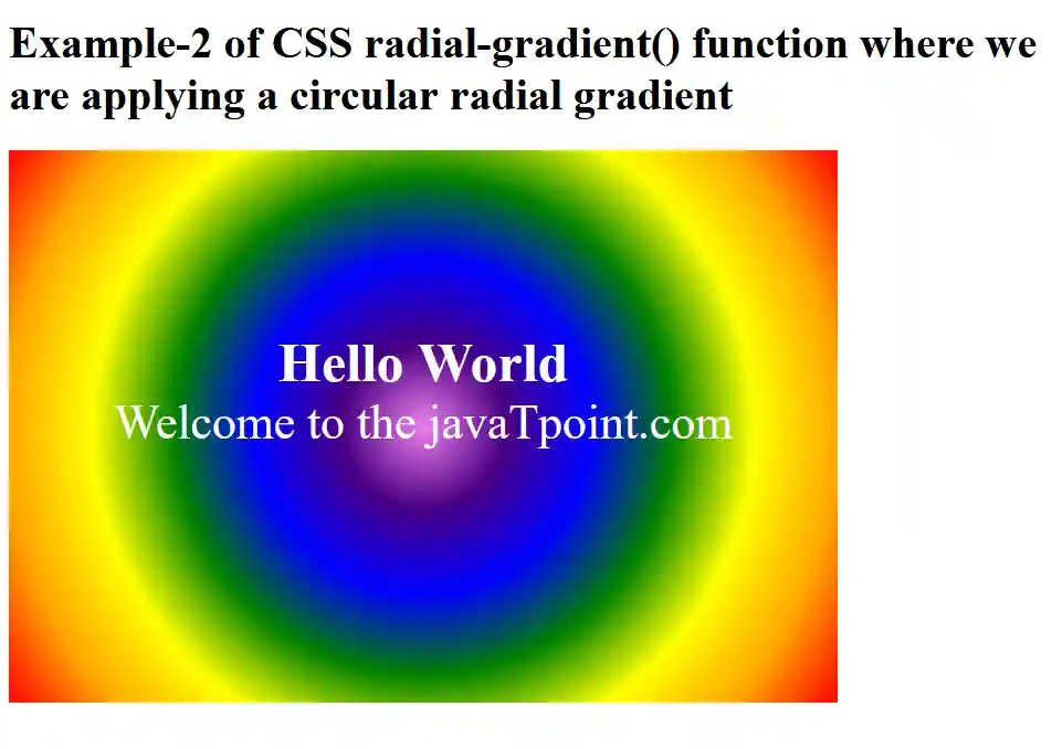
Example 2:
In this example, we will set the shape of the radial gradient of an HTML element.
Code:
Output:
As you can see in the output below, the background image is set to a circular radial gradient.
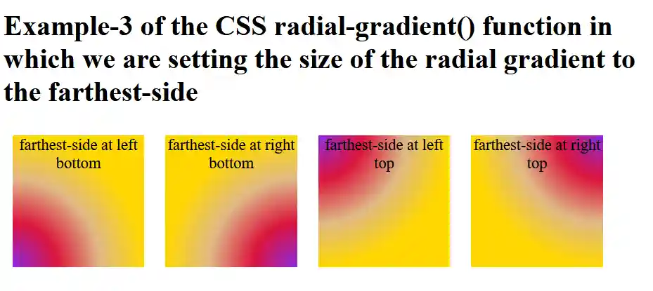
Example 3:
In this example, we will set the size of the radial gradient of the HTML elements to the farthest side.
Code:
Output:
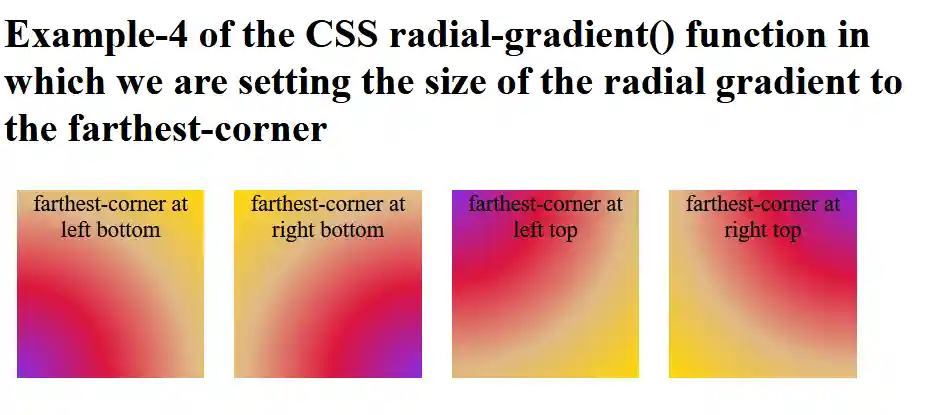
Example 4:
In this example, we will set the size of the radial gradient of the HTML elements to the farthest corner.
Code:
Output:
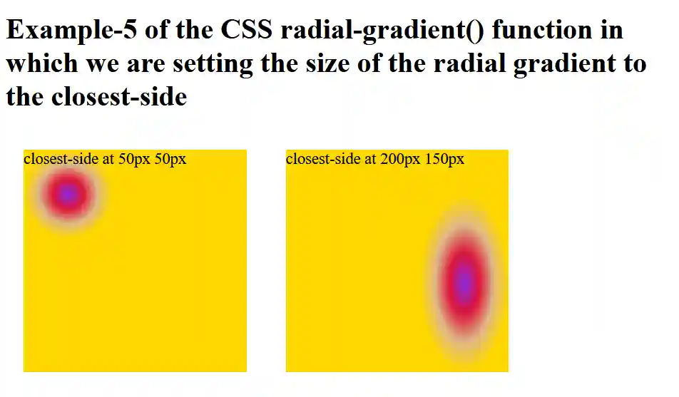
Example 5:
In this example, we will set the size of the radial gradient of the HTML elements to the closest side.
Code:
Output:
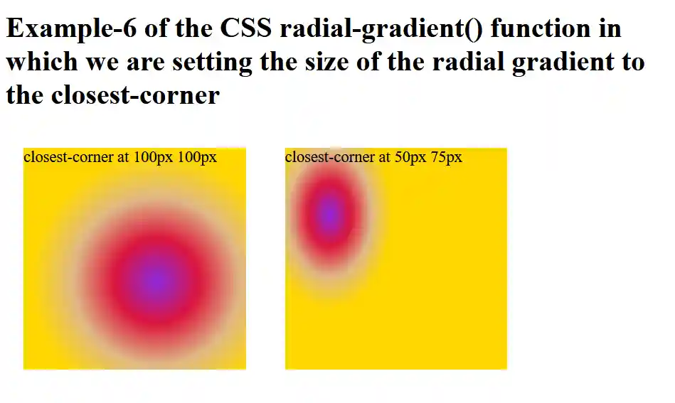
Example 6:
In this example, we will set the size of the radial gradient of the HTML elements to the closest corner.
Code:
Output:
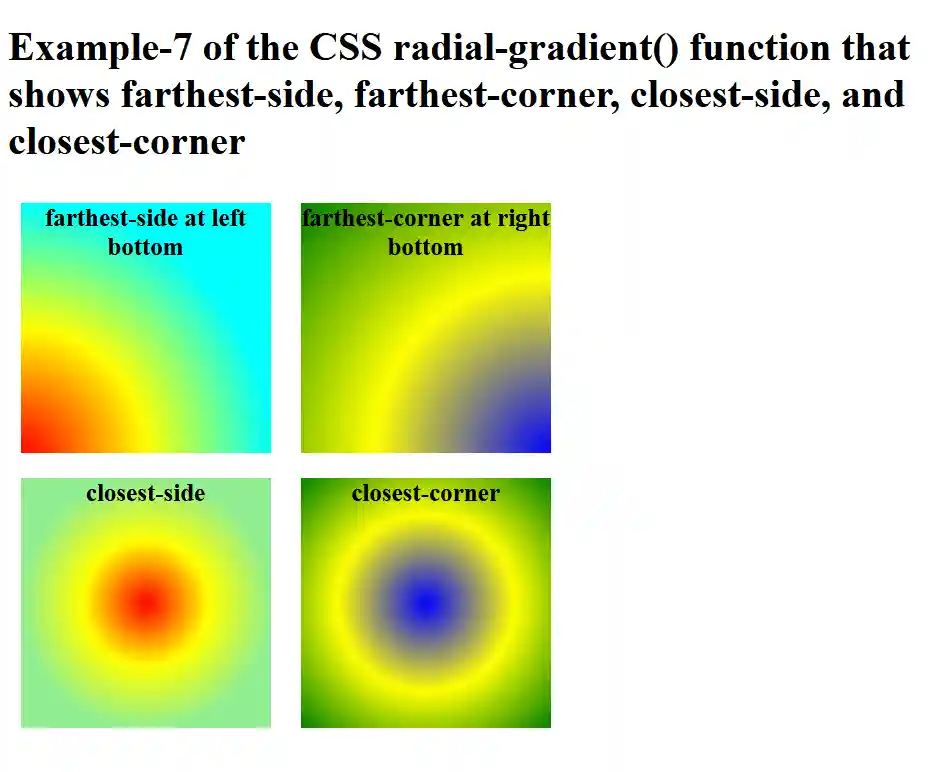
Example 7:
In this example, we will set the size of the radial gradient of the HTML elements to the farthest side, farthest corner, closest side, and closest corner.
Code:
Output:
Browsers Support:
- Mozilla Firefox
- Microsoft Edge
- Google Chrome
- Safari
- Opera
Conclusion
In this article, you have understood the CSS radial-gradient() function with examples that you can use to enhance the background of an HTML element.