A Material Design card: a panel with slightly rounded corners and an elevation shadow.
A card is a sheet of Material used to represent some related information, for example an album, a geographical location, a meal, contact details, etc.
This is what it looks like when run:
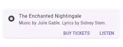
This sample shows creation of a Card widget that shows album information and two actions.
To create a local project with this code sample, run:
flutter create --sample=material.Card.1 mysample
Sometimes the primary action area of a card is the card itself. Cards can be one large touch target that shows a detail screen when tapped.
This sample shows creation of a Card widget that can be tapped. When tapped this Card's InkWell displays an "ink splash" that fills the entire card.
To create a local project with this code sample, run:
flutter create --sample=material.Card.2 mysample
For Material Design 2 (when ThemeData.useMaterial3 is false), there is a single card type: the elevated card. In that mode the named constructors (Card.filled, Card.outlined) behave the same as the default Card.
For Material Design 3 (when ThemeData.useMaterial3 is true), three visual variants are available: the default Card (elevated), Card.filled, and Card.outlined. All variants share the same theme class, CardThemeData, so theme properties (for example CardThemeData.shape) apply to every card variant within the theme's scope.
To create a local project with this code sample, run:
flutter create --sample=material.Card.3 mysample
See also:
- ListTile, to display icons and text in a card.
- showDialog, to display a modal card.
- material.io/design/components/cards.html
- m3.material.io/components/cards
- Inheritance
Constructors
- Card({Key? key, Color? color, Color? shadowColor, Color? surfaceTintColor, double? elevation, ShapeBorder? shape, bool borderOnForeground = true, EdgeInsetsGeometry? margin, Clip? clipBehavior, Widget? child, bool semanticContainer = true})
-
Creates an elevated variant of Card.
const
- Card.filled({Key? key, Color? color, Color? shadowColor, Color? surfaceTintColor, double? elevation, ShapeBorder? shape, bool borderOnForeground = true, EdgeInsetsGeometry? margin, Clip? clipBehavior, Widget? child, bool semanticContainer = true})
-
Create a filled variant of Card.
const
- Card.outlined({Key? key, Color? color, Color? shadowColor, Color? surfaceTintColor, double? elevation, ShapeBorder? shape, bool borderOnForeground = true, EdgeInsetsGeometry? margin, Clip? clipBehavior, Widget? child, bool semanticContainer = true})
-
Create an outlined variant of Card.
const
Properties
- borderOnForeground → bool
-
Whether to paint the shape border in front of the child.
final
- child → Widget?
-
The widget below this widget in the tree.
final
- clipBehavior → Clip?
-
The content will be clipped (or not) according to this option.
final
- color → Color?
-
The card's background color.
final
- elevation → double?
-
The z-coordinate at which to place this card. This controls the size of
the shadow below the card.
final
- hashCode → int
-
The hash code for this object.
no setterinherited
- key → Key?
-
Controls how one widget replaces another widget in the tree.
finalinherited
- margin → EdgeInsetsGeometry?
-
The empty space that surrounds the card.
final
- runtimeType → Type
-
A representation of the runtime type of the object.
no setterinherited
- semanticContainer → bool
-
Whether this widget represents a single semantic container, or if false
a collection of individual semantic nodes.
final
- shadowColor → Color?
-
The color to paint the shadow below the card.
final
- shape → ShapeBorder?
-
The shape of the card's Material.
final
- surfaceTintColor → Color?
-
The color used as an overlay on color to indicate elevation.
final
Methods
-
build(
BuildContext context) → Widget -
Describes the part of the user interface represented by this widget.
override
-
createElement(
) → StatelessElement -
Creates a StatelessElement to manage this widget's location in the tree.
inherited
-
debugDescribeChildren(
) → List< DiagnosticsNode> -
Returns a list of DiagnosticsNode objects describing this node's
children.
inherited
-
debugFillProperties(
DiagnosticPropertiesBuilder properties) → void -
Add additional properties associated with the node.
inherited
-
noSuchMethod(
Invocation invocation) → dynamic -
Invoked when a nonexistent method or property is accessed.
inherited
-
toDiagnosticsNode(
{String? name, DiagnosticsTreeStyle? style}) → DiagnosticsNode -
Returns a debug representation of the object that is used by debugging
tools and by DiagnosticsNode.toStringDeep.
inherited
-
toString(
{DiagnosticLevel minLevel = DiagnosticLevel.info}) → String -
A string representation of this object.
inherited
-
toStringDeep(
{String prefixLineOne = '', String? prefixOtherLines, DiagnosticLevel minLevel = DiagnosticLevel.debug, int wrapWidth = 65}) → String -
Returns a string representation of this node and its descendants.
inherited
-
toStringShallow(
{String joiner = ', ', DiagnosticLevel minLevel = DiagnosticLevel.debug}) → String -
Returns a one-line detailed description of the object.
inherited
-
toStringShort(
) → String -
A short, textual description of this widget.
inherited
Operators
-
operator ==(
Object other) → bool -
The equality operator.
inherited