NumberProgressBar for Windows Phone 8.1
The NumberProgressBar is a bar, slim and sexy (every man wants! ).
Thanks to daimajia design this beautiful Bar.
daimajia already build it for Android and Ming-zhe build it for IOS. So as beginner of Windows Phone 8.1 I decide build it for wp8.1. Hope I could learn more about wp8.1 and share it for every one who want to use it.
Demo

Usage
-
You should use Visual Studio 2013 with Update 2 or later.
-
Use NuGet to add the NumberProgressBar to your Project
-
To install NumberProgressBar, run the following command in the Package Manager Console
PM> Install-Package NumberProgressBar
OR
-
Open Nuget from Visual Studio
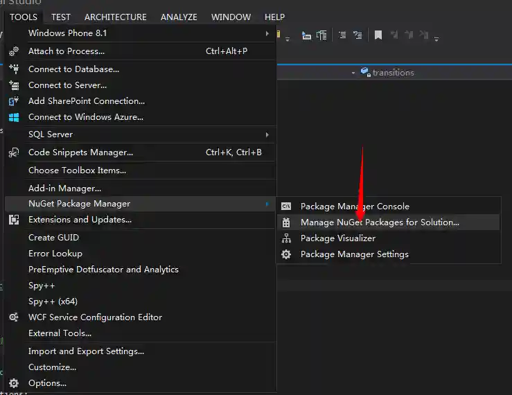
-
Search "NumberProgressBar" and Install it

-
add to your project


- Now You could find it in the "References"

- add namespace "Song" to your code
In XAML
<Page
    ......
    xmlns:song="using:Song"
    ......
    >
</Page>
In c#
- Use it and enjoy
<song:NumberProgressBar></song:NumberProgressBar>
- Use 'Progress' not 'Value' if you want to set the Progress you should use 'Progress' property.
- Use some Style
I also move some predesign style from daimajia. You can use them via ProgressBarStyle property.
like blow:
<song:NumberProgressBar
ProgressBarStyle="NumberProgressBar_Passing_Green" >
</song:NumberProgressBar>
In the above picture, the style is :
NumberProgressBar_Default
NumberProgressBar_Passing_Green
NumberProgressBar_Relax_Blue
NumberProgressBar_Grace_Yellow
NumberProgressBar_Warning_Red
NumberProgressBar_Funny_Orange
NumberProgressBar_Beauty_Red
NumberProgressBar_Twinkle_Night
And you could create your own Style for it.
like blow:
<StackPanel>
   <StackPanel.Resources>
            <Style x:Key="NumberProgressBar_Default" TargetType="song:NumberProgressBar">
                <Setter Property="Max" Value="100" />
                <Setter Property="Progress" Value="0" />

                <Setter Property="ProgressUnreachedColor" Value="#CCCCCC"/>
                <Setter Property="ProgressReachedColor" Value="#3498DB"/>

                <Setter Property="ProgressTextSize" Value="10"/>
                <Setter Property="ProgressTextColor" Value="#3498DB" />

                <Setter Property="ProgressReachedBarHeight" Value="1.5"/>
                <Setter Property="ProgressUnreachedBarHeight" Value="0.75"/>

            </Style>
        </StackPanel.Resources>

        <song:NumberProgressBar x:Name="song" Margin="0,60,0,0" Loaded="song_Loaded" Style="{StaticResource NumberProgressBar_Default}"></song:NumberProgressBar>
</StackPanel>
You can get more beautiful color from kular, and you can also contribute your color style to NumberProgressBar!
###Attributes
There are several attributes you can set:

The reached area and unreached area:
- color
- height
The text area:
- color
- text size
The bar:
- max progress
- current progress
About me:
A student in mainland China
Welcom to contact me.
Also welcom to offer me intership.Thanks in advances. ^_^
My blog: http://s2003zy.com
My email:s2003zy@gmail.com