6.2. Case Study Examples — Python
6.2.1. Examples
import matplotlib.pyplot as plt
import numpy as np


# evenly sampled time at 200ms intervals
t = np.arange(0., 5., 0.2)

# red dashes, blue squares and green triangles
plt.plot(t, t, 'r--', t, t**2, 'bs', t, t**3, 'g^')
plt.show()  # doctest: +SKIP
import matplotlib.pyplot as plt
import numpy as np


# evenly sampled time at 200ms intervals
t = np.arange(0., 5., 0.2)

# red dashes, blue squares and green triangles
plt.plot(t, t, 'r--')
plt.plot(t, t**2, 'bs')
plt.plot(t, t**3, 'g^')

plt.show()  # doctest: +SKIP
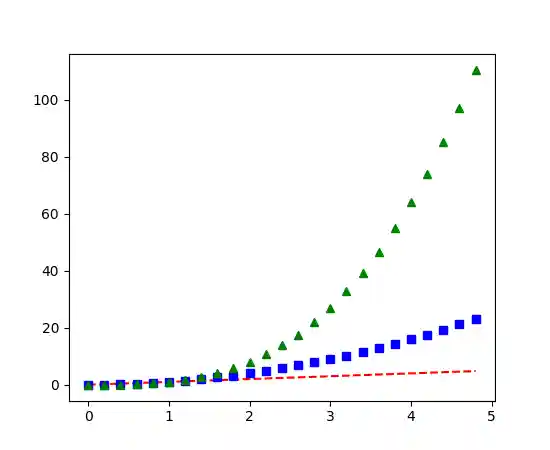
Figure 6.41. Multiple lines on one chart
6.2.2. Gallery
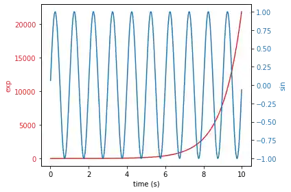
6.2.3. Scales
Code 6.15. Scales
import numpy as np
import matplotlib.pyplot as plt

# Create some mock data
t = np.arange(0.01, 10.0, 0.01)
data1 = np.exp(t)
data2 = np.sin(2 * np.pi * t)

fig, ax1 = plt.subplots()

color = 'tab:red'
ax1.set_xlabel('time (s)')
ax1.set_ylabel('exp', color=color)
ax1.plot(t, data1, color=color)
ax1.tick_params(axis='y', labelcolor=color)

ax2 = ax1.twinx()  # instantiate a second axes that shares the same x-axis

color = 'tab:blue'
ax2.set_ylabel('sin', color=color)  # we already handled the x-label with ax1
ax2.plot(t, data2, color=color)
ax2.tick_params(axis='y', labelcolor=color)

fig.tight_layout()  # otherwise the right y-label is slightly clipped
plt.show()
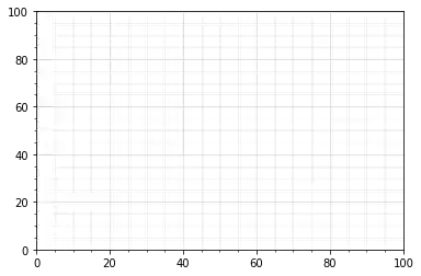
6.2.4. Grid
Code 6.16. Grid
import numpy as np
import matplotlib.pyplot as plt

fig = plt.figure()
ax = fig.add_subplot(1, 1, 1)

# Major ticks every 20, minor ticks every 5
major_ticks = np.arange(0, 101, 20)
minor_ticks = np.arange(0, 101, 5)

ax.set_xticks(major_ticks)
ax.set_xticks(minor_ticks, minor=True)
ax.set_yticks(major_ticks)
ax.set_yticks(minor_ticks, minor=True)

# And a corresponding grid
ax.grid(which='both')

# Or if you want different settings for the grids:
ax.grid(which='minor', alpha=0.2)
ax.grid(which='major', alpha=0.5)

plt.show()
6.2.5. Legend using pre-defined labels
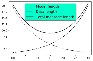
Code 6.17. Legend using pre-defined labels
import numpy as np
import matplotlib.pyplot as plt

# Make some fake data.
a = b = np.arange(0, 3, .02)
c = np.exp(a)
d = c[::-1]

# Create plots with pre-defined labels.
fig, ax = plt.subplots()
ax.plot(a, c, 'k--', label='Model length')
ax.plot(a, d, 'k:', label='Data length')
ax.plot(a, c + d, 'k', label='Total message length')

legend = ax.legend(loc='upper center', shadow=True, fontsize='x-large')

# Put a nicer background color on the legend.
# noinspection SpellCheckingInspection
legend.get_frame().set_facecolor('#00FFCC')

plt.show()
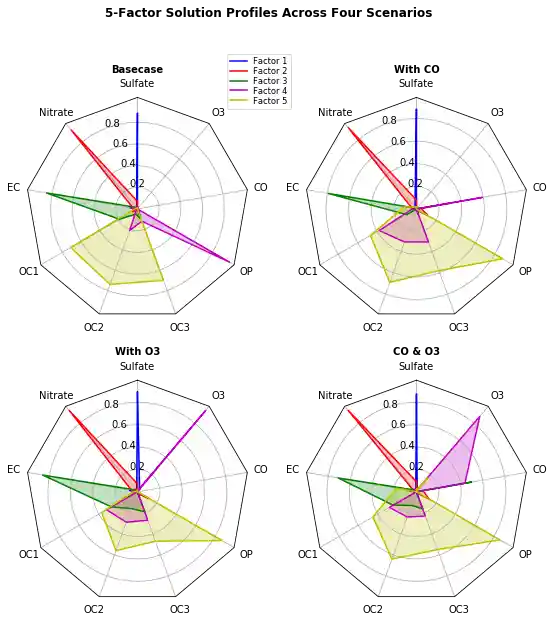
6.2.6. Radar Chart
Code 6.18. Radar Chart
import numpy as np

import matplotlib.pyplot as plt
from matplotlib.path import Path
from matplotlib.spines import Spine
from matplotlib.projections.polar import PolarAxes
from matplotlib.projections import register_projection


def radar_factory(num_vars, frame='circle'):
    """Create a radar chart with `num_vars` axes.
    This function creates a RadarAxes projection and registers it.

    num_vars : int
        Number of variables for radar chart.
    frame : {'circle' | 'polygon'}
        Shape of frame surrounding axes.
    """
    # calculate evenly-spaced axis angles
    theta = np.linspace(0, 2 * np.pi, num_vars, endpoint=False)

    def draw_poly_patch(self):
        # rotate theta such that the first axis is at the top
        vertices = unit_poly_vertices(theta + np.pi / 2)
        return plt.Polygon(vertices, closed=True, edgecolor='k')

    def draw_circle_patch(self):
        # unit circle centered on (0.5, 0.5)
        return plt.Circle((0.5, 0.5), 0.5)

    patch_dict = {'polygon': draw_poly_patch, 'circle': draw_circle_patch}
    if frame not in patch_dict:
        raise ValueError('unknown value for `frame`: %s' % frame)

    class RadarAxes(PolarAxes):

        name = 'radar'
        # use 1 line segment to connect specified points
        RESOLUTION = 1
        # define draw_frame method
        draw_patch = patch_dict[frame]

        def __init__(self, *args, **kwargs):
            super(RadarAxes, self).__init__(*args, **kwargs)
            # rotate plot such that the first axis is at the top
            self.set_theta_zero_location('N')

        def fill(self, *args, **kwargs):
            """Override fill so that line is closed by default"""
            closed = kwargs.pop('closed', True)
            return super(RadarAxes, self).fill(closed=closed, *args, **kwargs)

        def plot(self, *args, **kwargs):
            """Override plot so that line is closed by default"""
            lines = super(RadarAxes, self).plot(*args, **kwargs)
            for line in lines:
                self._close_line(line)

        def _close_line(self, line):
            x, y = line.get_data()
            if x[0] != x[-1]:
                x = np.concatenate((x, [x[0]]))
                y = np.concatenate((y, [y[0]]))
                line.set_data(x, y)

        def set_vertices_labels(self, labels):
            self.set_thetagrids(np.degrees(theta), labels)

        def _gen_axes_patch(self):
            return self.draw_patch()

        def _gen_axes_spines(self):
            if frame == 'circle':
                return PolarAxes._gen_axes_spines(self)
            # The following is a hack to get the spines (i.e. the axes frame)
            # to draw correctly for a polygon frame.

            # spine_type must be 'left', 'right', 'top', 'bottom', or `circle`.
            spine_type = 'circle'
            vertices = unit_poly_vertices(theta + np.pi / 2)
            # close off polygon by repeating first vertex
            vertices.append(vertices[0])
            path = Path(vertices)

            spine = Spine(self, spine_type, path)
            spine.set_transform(self.transAxes)
            return {'polar': spine}

    register_projection(RadarAxes)
    return theta


def unit_poly_vertices(theta):
    """Return vertices of polygon for subplot axes.

    This polygon is circumscribed by a unit circle centered at (0.5, 0.5)
    """
    x0, y0, r = [0.5] * 3
    vertices = [(r * np.cos(t) + x0, r * np.sin(t) + y0) for t in theta]
    return vertices


def example_data():
    # The following data is from the Denver Aerosol Sources and Health study.
    # See  doi:10.1016/j.atmosenv.2008.12.017
    #
    # The data are pollution source profile estimates for five modeled
    # pollution sources (e.g., cars, wood-burning, etc) that emit 7-9 chemical
    # species. The radar charts are experimented with here to see if we can
    # nicely visualize how the modeled source profiles change across four
    # scenarios:
    #  1) No gas-phase species present, just seven particulate counts on
    #     Sulfate
    #     Nitrate
    #     Elemental Carbon (EC)
    #     Organic Carbon fraction 1 (OC)
    #     Organic Carbon fraction 2 (OC2)
    #     Organic Carbon fraction 3 (OC3)
    #     Pyrolized Organic Carbon (OP)
    #  2)Inclusion of gas-phase specie carbon monoxide (CO)
    #  3)Inclusion of gas-phase specie ozone (O3).
    #  4)Inclusion of both gas-phase species is present...
    data = [
        ['Sulfate', 'Nitrate', 'EC', 'OC1', 'OC2', 'OC3', 'OP', 'CO', 'O3'],
        ('Basecase', [
            [0.88, 0.01, 0.03, 0.03, 0.00, 0.06, 0.01, 0.00, 0.00],
            [0.07, 0.95, 0.04, 0.05, 0.00, 0.02, 0.01, 0.00, 0.00],
            [0.01, 0.02, 0.85, 0.19, 0.05, 0.10, 0.00, 0.00, 0.00],
            [0.02, 0.01, 0.07, 0.01, 0.21, 0.12, 0.98, 0.00, 0.00],
            [0.01, 0.01, 0.02, 0.71, 0.74, 0.70, 0.00, 0.00, 0.00]]),
        ('With CO', [
            [0.88, 0.02, 0.02, 0.02, 0.00, 0.05, 0.00, 0.05, 0.00],
            [0.08, 0.94, 0.04, 0.02, 0.00, 0.01, 0.12, 0.04, 0.00],
            [0.01, 0.01, 0.79, 0.10, 0.00, 0.05, 0.00, 0.31, 0.00],
            [0.00, 0.02, 0.03, 0.38, 0.31, 0.31, 0.00, 0.59, 0.00],
            [0.02, 0.02, 0.11, 0.47, 0.69, 0.58, 0.88, 0.00, 0.00]]),
        ('With O3', [
            [0.89, 0.01, 0.07, 0.00, 0.00, 0.05, 0.00, 0.00, 0.03],
            [0.07, 0.95, 0.05, 0.04, 0.00, 0.02, 0.12, 0.00, 0.00],
            [0.01, 0.02, 0.86, 0.27, 0.16, 0.19, 0.00, 0.00, 0.00],
            [0.01, 0.03, 0.00, 0.32, 0.29, 0.27, 0.00, 0.00, 0.95],
            [0.02, 0.00, 0.03, 0.37, 0.56, 0.47, 0.87, 0.00, 0.00]]),
        ('CO & O3', [
            [0.87, 0.01, 0.08, 0.00, 0.00, 0.04, 0.00, 0.00, 0.01],
            [0.09, 0.95, 0.02, 0.03, 0.00, 0.01, 0.13, 0.06, 0.00],
            [0.01, 0.02, 0.71, 0.24, 0.13, 0.16, 0.00, 0.50, 0.00],
            [0.01, 0.03, 0.00, 0.28, 0.24, 0.23, 0.00, 0.44, 0.88],
            [0.02, 0.00, 0.18, 0.45, 0.64, 0.55, 0.86, 0.00, 0.16]])
    ]
    return data


if __name__ == '__main__':
    N = 9
    theta = radar_factory(N, frame='polygon')

    data = example_data()
    spoke_labels = data.pop(0)

    fig, axes = plt.subplots(figsize=(9, 9), nrows=2, ncols=2,
                             subplot_kw=dict(projection='radar'))
    fig.subplots_adjust(wspace=0.25, hspace=0.20, top=0.85, bottom=0.05)

    colors = ['b', 'r', 'g', 'm', 'y']
    # Plot the four cases from the example data on separate axes
    for ax, (title, case_data) in zip(axes.flatten(), data):
        ax.set_rgrids([0.2, 0.4, 0.6, 0.8])
        ax.set_title(title, weight='bold', size='medium', position=(0.5, 1.1),
                     horizontalalignment='center', verticalalignment='center')
        for d, color in zip(case_data, colors):
            ax.plot(theta, d, color=color)
            ax.fill(theta, d, facecolor=color, alpha=0.25)
        ax.set_vertices_labels(spoke_labels)

    # add legend relative to top-left plot
    ax = axes[0, 0]
    labels = ('Factor 1', 'Factor 2', 'Factor 3', 'Factor 4', 'Factor 5')
    legend = ax.legend(labels, loc=(0.9, .95),
                       labelspacing=0.1, fontsize='small')

    fig.text(0.5, 0.965, '5-Factor Solution Profiles Across Four Scenarios',
             horizontalalignment='center', color='black', weight='bold',
             size='large')

    plt.show()