5.4. Chart Histogram — Python
used to display number of elements in specific groups
5.4.1. Syntax
import matplotlib.pyplot as plt


x = [1, 2, 3, 4, 2, 3, 2]

plt.hist(x)
plt.show()  # doctest: +SKIP
5.4.2. Histogram
rwidth- width of a bar in percentagebinsare groups (segments)
import matplotlib.pyplot as plt


age = [
    44, 57, 74, 83, 101, 25, 73, 40,
    41, 47, 49, 35, 67, 39, 66, 48,
    58, 55, 23, 38, 54, 19, 31, 64,
    91, 22, 1, 46, 19, 31,
]

plt.hist(age, bins=4)
plt.show()  # doctest: +SKIP
import matplotlib.pyplot as plt


age = [
    44, 57, 74, 83, 101, 25, 73, 40,
    41, 47, 49, 35, 67, 39, 66, 48,
    58, 55, 23, 38, 54, 19, 31, 64,
    91, 22, 1, 46, 19, 31,
]

plt.hist(age, bins=10, rwidth=0.8)
plt.show()  # doctest: +SKIP
import matplotlib.pyplot as plt


age = [
    44, 57, 74, 83, 101, 25, 73, 40,
    41, 47, 49, 35, 67, 39, 66, 48,
    58, 55, 23, 38, 54, 19, 31, 64,
    91, 22, 1, 46, 19, 31,
]

bins = [0, 10, 20, 30, 40, 50, 60, 70, 80, 90, 100, 110, 120, 130]

plt.hist(age, bins, rwidth=0.8)
plt.show()  # doctest: +SKIP
import matplotlib.pyplot as plt


age = [
    44, 57, 74, 83, 101, 25, 73, 40,
    41, 47, 49, 35, 67, 39, 66, 48,
    58, 55, 23, 38, 54, 19, 31, 64,
    91, 22, 1, 46, 19, 31,
]

bins=[0, 6, 18, 25, 65, max(age)]

plt.hist(age, bins, rwidth=0.8)
plt.show()  # doctest: +SKIP
import matplotlib.pyplot as plt
import numpy as np
np.random.seed(0)


mu = 0
sigma = 1
x = mu + sigma * np.random.randn(10000)

plt.hist(x, bins=50, rwidth=0.9)
plt.show()  # doctest: +SKIP
import matplotlib.pyplot as plt
import numpy as np
np.random.seed(0)


x = np.random.normal(size=10000)

plt.hist(x, bins=50)
plt.show()  # doctest: +SKIP
5.4.3. Histogram chart
import matplotlib.pyplot as plt


population_ages = [22, 55, 62, 45, 21, 22, 34, 42, 42, 4, 99, 102,
                   110, 120, 121, 122, 130, 111, 115, 112, 80, 75,
                   65, 54, 44, 43, 42, 48]

bins = [0, 10, 20, 30, 40, 50, 60, 70, 80, 90, 100, 110, 120, 130]

plt.hist(population_ages,
         bins=bins,               # age groups (segments)
         histtype='bar',          # type of the histogram
         rwidth=0.8,              # width of a bar
         label='Population Ages')

plt.xlabel('Person number')
plt.ylabel('Age')
plt.title('Histogram')
plt.legend()

plt.show()  # doctest: +SKIP
5.4.4. Examples
5.4.5. Simple
import matplotlib.pyplot as plt
import numpy as np
np.random.seed(0)


ages = np.random.randint(size=50, low=0, high=130)
age_groups = [0, 10, 20, 30, 40, 50, 60, 70, 80, 100, 110, 120, 130]

plt.hist(ages, age_groups, histtype='bar', rwidth=0.8)
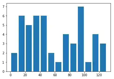
Figure 5.17. Histogram
5.4.6. Normal Distribution
import matplotlib.pyplot as plt
import numpy as np
np.random.seed(0)


mu, sigma = 100, 15
x = mu + sigma * np.random.randn(10000)

# the histogram of the data
n, bins, patches = plt.hist(x, 50, normed=1, facecolor='g', alpha=0.75)


plt.xlabel('Smarts')
plt.ylabel('Probability')
plt.title('Histogram of IQ')
plt.text(60, .025, r'$\mu=100,\ \sigma=15$')
plt.axis([40, 160, 0, 0.03])
plt.grid(True)
plt.show()  # doctest: +SKIP
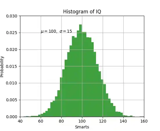
Figure 5.18. Working with text