3.8. Figure Multiple Figures and Plots — Python
3.8.1. Multiple Plots on one Figure
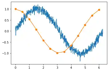
import matplotlib.pyplot as plt
import numpy as np
np.random.seed(0)


x1 = [x * 0.01 for x in range(0, 628)]
y1 = [np.sin(x * 0.01) + np.random.normal(0.0, 0.1) for x in range(0, 628)]

x2 = [x * 0.5 for x in range(0, round(63 / 5))]
y2 = [np.cos(x * 0.5) for x in range(0, round(63 / 5))]

plt.plot(x1, y1)
plt.plot(x2, y2, 'o-')

plt.show()  # doctest: +SKIP
3.8.2. Multiple Figures with single Plots
import matplotlib.pyplot as plt
import numpy as np

x = np.linspace(0.0, 10.0, 1000)
y = np.sin(x)

fig, ax = plt.subplots(nrows=2, ncols=2, figsize=(18, 5))

ax[0,0].plot(x, y, label='a')
ax[0,1].plot(x, y, label='b')
ax[1,0].plot(x, y, label='c')
ax[1,1].plot(x, y, label='d')

plt.show()  # doctest: +SKIP
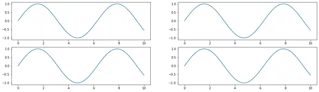
Figure 3.19. Multiple Figures with single Plots
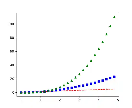
import matplotlib.pyplot as plt
import numpy as np

def damp(t):
    return np.exp(-t) * np.cos(2*np.pi*t)


x1 = np.arange(0.0, 5.0, 0.1)
x2 = np.arange(0.0, 5.0, 0.02)
y2 = np.cos(2*np.pi*x2)


plt.figure(1, figsize=(15, 5))

plt.subplot(211)
plt.plot(x1, damp(x1), color='blue', marker='o', label='data')
plt.plot(x2, damp(x2), color='black', label='datapoints')

plt.subplot(212)
plt.plot(x2, y2, color='red', linestyle='--', label='signal')

plt.show()  # doctest: +SKIP
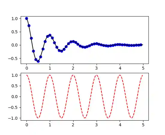
Figure 3.20. Working with multiple figures and axes
3.8.3. Multiple Charts in Grid
Code 3.1. Multiple Charts in Grid
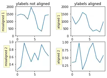
import numpy as np
import matplotlib.pyplot as plt

box = dict(facecolor='yellow', pad=5, alpha=0.2)

fig, ((ax1, ax2), (ax3, ax4)) = plt.subplots(2, 2)
fig.subplots_adjust(left=0.2, wspace=0.6)

# Fixing random state for reproducibility
np.random.seed(19680801)

ax1.plot(2000 * np.random.rand(10))
ax1.set_title('ylabels not aligned')
ax1.set_ylabel('misaligned 1', bbox=box)
ax1.set_ylim(0, 2000)

ax3.set_ylabel('misaligned 2', bbox=box)
ax3.plot(np.random.rand(10))

xlabel = -0.3  # axes coords

ax2.set_title('ylabels aligned')
ax2.plot(2000 * np.random.rand(10))
ax2.set_ylabel('aligned 1', bbox=box)
ax2.yaxis.set_label_coords(xlabel, 0.5)
ax2.set_ylim(0, 2000)

ax4.plot(np.random.rand(10))
ax4.set_ylabel('aligned 2', bbox=box)
ax4.yaxis.set_label_coords(xlabel, 0.5)

plt.show()
3.8.4. plt.plot() vs. ax.plot()
fig = plt.figure()
plt.plot(data)
fig.show()
Takes the current figure and axes (if none exists it will create a new one) and plot into them:
In your case, the behavior is same as before with explicitly stating the axes for plot:
ax = plt.axes()
line = ax.plot(data)
This approach of using
ax.plot(...)is a must, if you want to plot into multiple axes (possibly in one figure). For example when using a subplots. Explicitly creates new figure - you will not add anything to previous one. Explicitly creates a new axes with given rectangle shape and the rest is the same as with 2:fig = plt.figure() ax = fig.add_axes([0,0,1,1]) line = ax.plot(data)
possible problem using
figure.add_axesis that it may add a new axes object to the figure, which will overlay the first one (or others). This happens if the requested size does not match the existing ones.